You spent an hour building a carousel, picked the fonts, aligned the text, exported it. Uploaded it to Instagram, and the first slide came out cropped. The text you put in the bottom third? Gone.
This happens because Instagram doesn’t ask what size you designed at. It takes your file and resizes it to fit its own display logic. If your dimensions don’t match what Instagram expects, it fills the gap by cropping, compressing, or adding white borders. None of which you chose.
The fix isn’t complicated, but it has to be intentional. Instagram carousels run on three supported aspect ratios. Every slide in your carousel must match the same ratio, because the first image you upload sets the format for the entire post. Switch ratios mid-carousel and Instagram forces consistency on you, usually by cropping in a way that breaks your design.
Instagram Size Finder
What are you posting?
This post covers the exact dimensions for each format, which one to use based on your goal, and how to set them up without rebuilding your design every time you switch platforms.
Instagram Carousel Dimensions (2026)
Instagram supports three carousel formats. Each has different use cases, different psychological effects on the reader, and different consequences if you get it wrong.
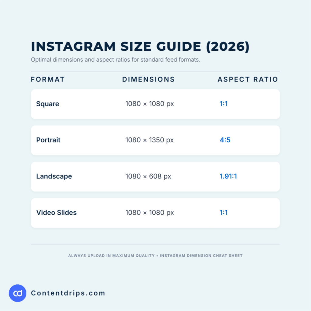
Square: 1080 × 1080 px (1:1 ratio)
The workhorse. Square carousels are the most universally safe format on Instagram. They display consistently in the feed, in Explore, on profile grids, and in direct shares. If you’re unsure which format to use, default to square.
Best for: Educational slides, quote carousels, listicles, step-by-step breakdowns, B2B content, anything where consistency across devices matters.
The trade-off: Square doesn’t dominate the feed the way portrait does. It takes up less vertical screen space, which means more competing content is visible at the same time. You’re making it easier for someone to scroll past you.
Portrait: 1080 × 1350 px (4:5 ratio)
Portrait is the power move. It takes up the maximum vertical space Instagram allows in the feed, which means it pushes competitor content below the fold. When someone stops their scroll on your carousel, portrait holds the screen better than any other format.
Best for: High-stakes content you want people to stop on: hook slides, story-driven carousels, coaching and education content, anything where the first slide needs to earn the swipe.
The trade-off: Portrait can get clipped on some profile grid views and looks different when shared to Stories. Also, if your design isn’t strong, portrait makes the weakness more obvious.
Landscape: 1080 × 608 px (1.91:1 ratio)
Landscape is the underdog format that most creators ignore, and that’s partly why it works for those who use it deliberately. It mimics the cinematic, wide format, which reads as high production value.
Best for: Behind-the-scenes content, photography showcases, brand storytelling with strong visual assets, real estate listings, product reveals.
The trade-off: Landscape takes up the least vertical space in the feed. It’s the format with the smallest screen real estate. Use it when the visual itself is the hook, not the text.
The Specs Table
| Format | Dimensions | Aspect Ratio | File Size Limit | File Type |
|---|---|---|---|---|
| Square | 1080 × 1080 px | 1:1 | 30 MB | JPG, PNG |
| Portrait | 1080 × 1350 px | 4:5 | 30 MB | JPG, PNG |
| Landscape | 1080 × 608 px | 1.91:1 | 30 MB | JPG, PNG |
| Video slides | 1080 × 1080 px | 1:1 | 4 GB | MP4, MOV |
Additional technical rules:
- Minimum resolution: 320 × 320 px (always hit 1080 minimum for quality)
- Maximum slides per carousel: 10
- Minimum slides: 2
- Color mode: RGB (not CMYK, which will shift on upload)
- Max video length per slide: 60 seconds
- Recommended DPI: 72 (screen rendering; higher doesn’t help on Instagram)
Here’s the section, ready to paste in:
Font Size for Instagram Carousel Slides
The most common mistake with carousel typography isn’t choosing the wrong font. It’s designing at the wrong scale. What looks readable on your 27-inch monitor at 100% zoom will be illegible on a 6-inch phone screen.
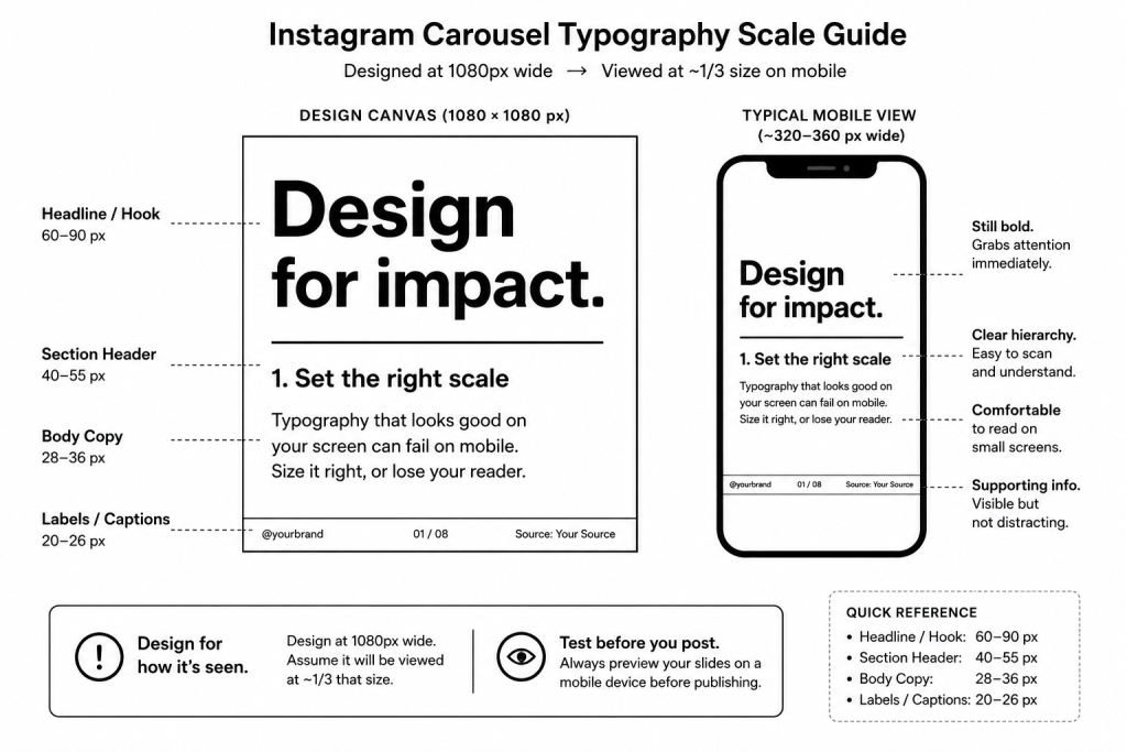
Instagram renders carousel slides at widths between 320 px and 1080 px depending on the device. Design at 1080 px and assume your slide will be viewed at roughly one-third that size in practice. That changes everything about how you set type.
Recommended sizes (at 1080 × 1080 px or 1080 × 1350 px canvas):
- Headline / hook text: 60–90 px. This is the text on slide 1 that earns the swipe. If someone has to squint, you’ve already lost them.
- Section headers: 40–55 px. Used for slide titles in educational or listicle formats.
- Body copy: 28–36 px. Anything smaller than 28 px becomes a readability problem on mobile. If your text requires 24 px to fit, cut the text, not the size.
- Labels, captions, footnotes: 20–26 px. Fine for supporting text that isn’t load-bearing — slide numbers, source citations, subtle tags.
The 10-word rule. If a single slide has more than 10 words at body size, you’re almost certainly trying to fit too much on one slide. Shrinking the font to make it fit is the wrong solution. Split the content across two slides instead.
Contrast matters more than size. A 36 px dark gray on a medium gray background is harder to read than a 28 px black on white. Always check contrast ratio — aim for at least 4.5:1 for body text. Light text on a light background or dark text on a dark background will get clipped by Instagram’s compression and become unreadable even at large sizes.
Stick to one or two typefaces. One for headlines, one for body. Mixing three or more fonts across a carousel reads as inconsistent and unfocused. If you’re using a tool like Contentdrips, your brand font system travels with the template so consistency is automatic across every slide.
Format vs. Goal: Which Size to Use
Choosing a format without anchoring it to a goal is the most common mistake. Here’s how the mapping works.
If your goal is reach and new audience growth: Use portrait (1080 × 1350). More screen dominance on the first slide means more time to earn the swipe from someone who doesn’t follow you yet.
If your goal is saves and educational authority: Use square (1080 × 1080). Educational content is often saved to revisit, and square is the most notebook-friendly format visually. It signals structured information.
If your goal is aesthetic credibility: Use landscape (1080 × 608). Photographers, interior designers, architects, real estate professionals, and premium product brands look more polished in landscape.
If your goal is engagement and comments: Format matters less than the hook. But if you must choose, go portrait, because the hook slide is bigger.
If your goal is profile grid cohesion: Square is your friend. It creates a clean, predictable grid that looks intentional on your profile page.
When Carousels Work and When They Don’t
Carousels work exceptionally well when:
- The value is in the sequence. The reader needs to move through slides in order to understand the full point. Each slide should create a micro-commitment to keep swiping.
- The content rewards the swipe. Educational breakdowns, step-by-step frameworks, myth-busting series, before/after formats. These all have a built-in reason to keep going.
- You have something to teach, not just say. A single strong opinion becomes a caption. Ten supporting points become a carousel.
- Your audience is in discovery or consideration mode. Carousels are slow content. They require a slightly warmer audience than a Reel.
Carousels don’t work when:
- The information fits in one slide. If you’re padding slides to hit the format, the reader will feel it. Filler slides kill saves.
- You’re chasing viral reach. Reels and single images typically outperform carousels for raw reach metrics. Carousels trade reach for depth.
- The visuals aren’t at least decent. A Canva template with default fonts and stock photos doesn’t stop a scroll in 2026. The bar has risen.
- You have no distribution strategy. The best carousel in the world still needs a hook, a posting time, and either an engaged existing audience or a paid push to get initial momentum.
Are Carousels Worth It for Your Specific Situation?
If you’re a SaaS founder
Yes, with caveats. Carousels are excellent for LinkedIn (more on that in a separate guide), and they work on Instagram if your ICP is actually on Instagram. B2B SaaS founders often chase LinkedIn carousels and ignore Instagram entirely. If your buyer persona is a millennial decision-maker who’s professionally active on Instagram, carousels are worth building into your content system. If your buyer is a CTO scrolling LinkedIn at 7am, Instagram carousels are probably low ROI.
Recommended format: Square (1080 × 1080) for educational product breakdowns, feature announcements, customer results.
If you’re a freelance designer or creative
Absolutely worth it, and probably one of the highest-leverage uses of your time. Carousels let you show your thinking, not just your output. A carousel that walks through your creative process (brief, concepts, revisions, final) builds far more trust than a single portfolio image. It’s a sales document disguised as content.
Recommended format: Portrait (1080 × 1350) for maximum visual impact. Landscape if you’re showing wide-format work like packaging or environmental design.
If you’re a coach or course creator
Carousels are your bread and butter on Instagram. Your audience wants to learn, they’re already conditioned to swipe on educational content, and each carousel is a proof-of-concept that you know what you’re talking about. Ten carousels is essentially a free mini-course that builds trust faster than ten single posts.
Recommended format: Portrait for hook slides. Consider mixing portrait hooks with square body slides if you want a distinctive visual rhythm.
If you’re an agency owner
Use carousels for lead generation content: results, case studies, process breakdowns. But be realistic. Most agency growth on Instagram happens through DM conversations, not organic reach. Carousels warm the audience; the pitch happens elsewhere.
Recommended format: Square for reliability across client content systems. It’s easier to templatize, hand off to a team, and maintain brand consistency at scale.
The Real Reason Your Carousels Aren’t Getting Reach
If you’re getting impressions but no saves, the content isn’t delivering on the promise of the hook. Fix the middle slides.
If you’re getting saves but no reach, your first slide isn’t earning the scroll stop. Fix the hook.
If you’re getting neither, one of three things is true:
- The hook is weak. Your first slide needs to make a specific, compelling promise visible without clicking. “5 things I learned” is not a hook. “Why most designers undercharge by 40%” is a hook.
- The format doesn’t match platform behavior. Instagram’s algorithm in 2026 rewards time spent. A carousel that gets completed (all slides swiped) signals value. If your slides aren’t compelling people to keep going, completion rate drops and so does reach.
- The design is working against you. Cluttered slides, inconsistent fonts, low-contrast text, or no visual hierarchy all cause people to exit early. Design isn’t decoration. It’s retention.
Should You Make Carousels Yourself or Use Templates?
Build from scratch if:
- You have a designer on your team or you are one
- Your brand system is mature enough that you know exactly what every slide should look like
- You have time to invest in a full custom design system upfront
- Your content is so differentiated that templates would dilute it
Use rigid templates if:
- You’re just starting and need something that looks good faster than you can design
- Your content volume is low (1 to 2 carousels per week)
- Brand differentiation isn’t a priority yet
- You’re testing what type of carousel content resonates before investing in design
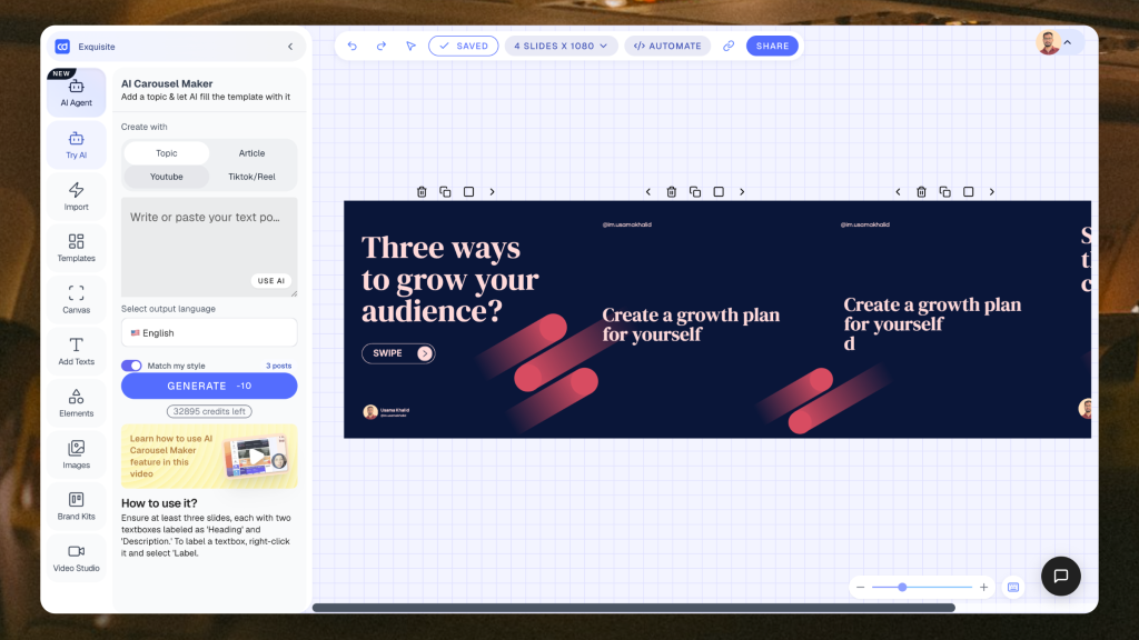
Use a flexible tool like Contentdrips if:
- You need both speed and control: templates that don’t look like templates
- You’re posting across multiple platforms and resizing manually is eating your time
- You want to create once and adapt for Instagram, LinkedIn, TikTok, and beyond without starting over
- You’re building a content system at scale (multiple clients, multiple formats, high volume)
How Contentdrips Handles the Sizing Problem
Most creators know the dimensions. The problem is that most tools make it painful to work across them.
You design a portrait carousel for Instagram. Your client wants it on LinkedIn (1200 × 1500). Your TikTok audience wants it as a slideshow (1080 × 1920). In most tools, that’s starting over three times.
Contentdrips is built differently. The canvas supports any custom dimension. You enter the width and height you need, hit Set, and the canvas adjusts. There are no locked presets that trap you in a single format.
Inside Contentdrips, here’s how the sizing system actually works:
In the Canvas view, you’ll find a “Resize Canvas” section in the left panel. You can type any custom W × H values and hit Set to apply them instantly. Below the custom input, platform presets are organized by network: LinkedIn (Square 1200×1200, Portrait 1200×1500, Landscape 1200×628) and Instagram (Square 1080×1080, Portrait 1080×1350, Landscape 1080×608) are all one click away. There’s also a “Magic Resize” toggle that reflows your content when you switch dimensions.
In the Templates section, when you click “Create Design,” you’ll see a full template library organized by platform. Instagram templates are broken out by format type: Square Post (1080×1080), Portrait Post (1080×1350), Landscape Post (1080×566), Story/Reel (1080×1920), and Profile Photo (320×320). You pick the format that fits your need, then choose from pre-made designs. Or select “Custom Template” in the top right to set your own dimensions from scratch.
The practical advantage: If you find a template you love in Square format but need it in Portrait for this week’s campaign, you don’t rebuild it. You change the canvas dimensions, use Magic Resize to get close, make your manual adjustments, and you’re done. The design system travels with you across formats.
For multi-platform creators and agencies, the resize workflow that used to mean three separate Canva files (one per platform) is now one Contentdrips file with three export variants.
The Slide-by-Slide Structure That Holds Across Niches
Format is the container. Structure is what fills it.
Slide 1: The Hook One bold promise, provocative statement, or specific curiosity gap. No more than 10 words on screen. This slide must work as a standalone thumbnail. If someone screenshots only slide 1 and shares it, does it still make sense?
Slide 2: The Setup or Stakes Why does this matter? Who is it for? What’s at risk if they don’t keep reading? This slide earns the transition from curious to committed.
Slides 3 to 8: The Value Delivery Each slide delivers one discrete point. Not a paragraph, one point. If you find yourself shrinking the font to fit more text, cut it. One insight per slide, formatted for readability from a phone screen.
Slide 9: The Summary or Tension Slide Bring it back together. What’s the through-line? What should they remember? This is often where saves happen, when someone wants to come back to the summary.
Slide 10: The CTA Be specific. “Follow for more” is noise. “Save this for your next content planning session” is a directive. “DM me CAROUSEL and I’ll send you the template” is a conversion.
Pre-Post Checklist
Run through this before every carousel goes live:
- Is the hook visible without tapping? (No cut-off text, no critical info below the fold)
- Are all slides at least 1080 px wide?
- Is the aspect ratio consistent across all slides?
- Does each slide deliver one clear point?
- Is the CTA on the final slide specific and actionable?
- Did you check the file size (under 30 MB per image)?
- Is color mode set to RGB, not CMYK?
- Does slide 1 work as a standalone thumbnail?
- Ready to schedule your Instagram carousel?
The Bottom Line
Portrait dominates the feed. Square wins on versatility. Landscape earns aesthetic credibility. The format you choose should come from your goal, not from what someone told you is best.
If you’re spending more than 20 minutes resizing carousels across platforms, that’s a tooling problem. Contentdrips was built so any dimension on any platform works: custom W × H inputs, platform presets, Magic Resize, all in one canvas. Pick a template, set your size, and build once for everywhere.
The creators winning with carousels in 2026 aren’t the ones with the most design skills. They’re the ones with the tightest systems. Get the dimensions right, get the structure right, get the tool right, and the results follow.
Sizes sorted — now generate the carousel itself with AI.
FAQs About Instagram Carousel Size and Format
What is the best size for an Instagram carousel in 2026?
It depends on your goal. Portrait (1080 × 1350 px) takes up the most vertical space in the feed and gives your first slide the best chance of stopping a scroll. Square (1080 × 1080 px) is the safest all-round choice. It displays consistently across the feed, Explore, profile grids, and shares. Landscape (1080 × 608 px) suits visual-first content like photography or product showcases but takes up the least screen space. If you’re unsure, start with square.
Do all slides in a carousel have to be the same size?
Yes. The first image you upload sets the aspect ratio for the entire post. Every slide that follows must match that ratio. If you upload slides with mixed dimensions, Instagram forces consistency by cropping or adding white borders, usually in ways that break your layout. Prepare all slides at identical dimensions before uploading.
What happens if I upload the wrong size?
Instagram will automatically resize your image to fit its display requirements. This typically means compression (which reduces image quality), cropping (which cuts off parts of your design), or letterboxing (white or black bars added around your image). None of these are under your control once the file is uploaded. The only reliable fix is to resize before uploading.
Can I mix photos and videos in one carousel?
Yes. Instagram allows mixed-media carousels with both images and video slides. Videos in carousels follow the same dimensional guidelines as images. Use 1080 × 1080 px for square, 1080 × 1350 px for portrait. Keep all media at the same aspect ratio across the carousel to avoid inconsistent display.
Why does my carousel look blurry after uploading?
Instagram compresses all uploaded files to reduce load times. If your source file is already compressed or saved at low quality, the platform’s additional compression makes it noticeably blurry. Always export carousel slides as high-quality JPGs or PNGs at exactly 1080 px wide, in RGB color mode. Starting with a larger file than needed doesn’t help. Excessive downscaling increases compression artifacts. Match the spec exactly.
Does the carousel format affect reach on Instagram?
Format alone doesn’t directly determine reach, but it influences the metrics that do. Portrait carousels take up more screen space, which increases the chance a user pauses on your post. Longer dwell time signals value to the algorithm. Carousel completion rate (how many people swipe through all slides) is also a positive signal. A format that encourages swiping and holds attention longer indirectly supports wider distribution.
How do I resize a carousel for multiple platforms without rebuilding it?
Most tools require you to start over when switching between platform dimensions. Contentdrips handles this differently. The canvas accepts any custom W × H dimensions, and platform presets for Instagram, LinkedIn, TikTok, and others are built in. If you’ve already designed a carousel in one format, you change the canvas size, use Magic Resize to reflow the content, make any manual adjustments, and export. One design, multiple platform sizes, without rebuilding from scratch.
What is the safe zone for Instagram carousel slides?
Keep all critical text and visual elements at least 150 to 200 px away from all edges. Instagram can clip edges during display, particularly on the profile grid view and when posts are shared to Stories. Anything placed too close to the border risks being cut off depending on how and where the post is viewed.
How many slides should an Instagram carousel have?
Instagram allows between 2 and 10 slides. For educational carousels, 7 to 10 slides gives you enough room to deliver real value. For product showcases or before/after content, 3 to 5 slides is usually enough. Avoid padding slides just to hit a number. Every slide that doesn’t add something gives the reader a reason to stop swiping.
What file type should I use for Instagram carousel slides?
JPG or PNG for images. MP4 or MOV for video slides. JPG handles photographs well and produces smaller file sizes. PNG is better for slides with text, flat graphics, or transparency. It preserves sharp edges that JPG compression can soften. Keep image files under 30 MB per slide.

Amna Anjum is an Associate at Contentdrips, working closely with the product and how creators use it day to day. She specializes in social content strategy, with deep knowledge of how carousels, graphics, and threads perform across Instagram, LinkedIn, Twitter, and TikTok. She writes from firsthand experience with the tools and workflows she covers.