LinkedIn reach is down for almost everyone. Views have dropped around 50% compared to last year. Follower growth has stalled. Marketers are cycling through formats, chasing the next fix, and getting diminishing returns across the board.
One format has quietly held its ground and is actually growing in performance. Most people are not using it. The window to get ahead of the crowd is still open, but it will not stay open forever.
That format is the LinkedIn document post.
What Is a LinkedIn Document Post?
A LinkedIn document post is a natively uploaded file, typically a PDF, that renders as a swipeable, multi-slide experience directly inside the LinkedIn feed. Viewers scroll through every slide without ever leaving the platform. No external link, no click-out, no friction.
This is different from sharing a link to a PDF or attaching a file to a message. When you upload a PDF as a document post, LinkedIn converts each page into a slide and serves the entire thing as an interactive, in-feed experience. That distinction matters more than most people realise, and the algorithm reflects it.
Document posts are commonly called LinkedIn carousels, and the terms are used interchangeably. The key is that the content lives inside the feed and moves on the viewer’s terms.
Why the LinkedIn Algorithm Rewards Document Posts in 2026
The numbers here are not subtle.
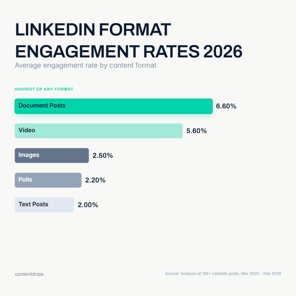
According to AuthoredUp’s analysis of over three million LinkedIn posts from March 2025 through February 2026, document posts generate 39% more reach and 30% more engagement than the average LinkedIn post. They carry a 6.60% average engagement rate, the highest of any content format on the platform, compared to around 2% for text posts.
The reason is dwell time. LinkedIn’s algorithm now weights how long someone spends on a piece of content, and a carousel that keeps a viewer swiping for 15 to 20 seconds sends a significantly stronger signal than a text post someone scans in three. Every swipe registers as an engagement signal. The format is built to accumulate them.
Saves compound this effect. Documents account for 12.92% of all saved posts on LinkedIn, roughly 2.6 times their share of total content. In 2026, saves are the single most powerful distribution signal on the platform. One save drives approximately five times more reach than a like. Document posts are the format that earns saves most reliably because viewers treat them as reference material they will want to come back to.
Then there is the competition gap. Only 4.88% of LinkedIn creators are posting documents regularly. That means the format is delivering top-tier algorithmic performance in a lane that is almost empty. That combination of high reward and low competition is genuinely rare on any platform.
What Makes a LinkedIn Document Post Actually Work
Knowing that the format performs is one thing. Understanding why specific document posts outperform others is what separates creators who get 200 views from those who get 20,000.
There are two distinct layers: content structure and visual design. Both matter, and most creators only think about one of them.
Content Structure
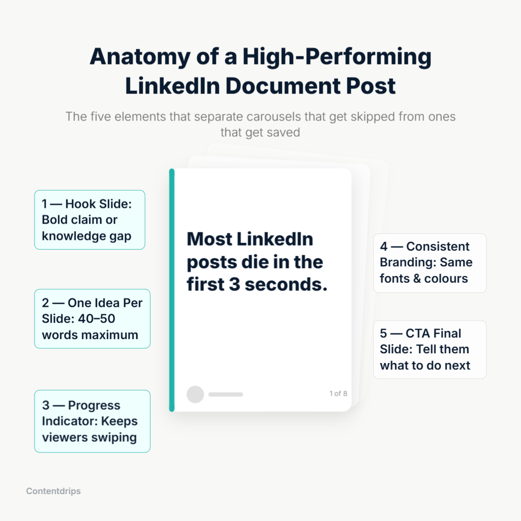
- The first slide is the only one that earns the swipe. Your hook slide is the thumbnail of your carousel. If it does not create an immediate knowledge gap, a surprising claim, or a problem the reader recognises in themselves, nobody swipes. 50% of your creative effort should go into slide one. A weak opening kills reach before the algorithm has a chance to help you. For guidance on writing hooks that stop the scroll, the Contentdrips guide to writing high-performing LinkedIn posts is a practical place to start.
- One idea per slide, no exceptions. Each slide should communicate one clear point in 40 to 50 words maximum. When a slide tries to do two things, it does neither well. Dense slides cause drop-off. White space and a single sharp idea always win.
- Progress cues keep viewers moving. Adding a small slide indicator like “3 of 8” or a visual progress bar gamifies the reading experience. It gives viewers a sense of completion and motivates them to reach the end.
- The final slide should do real work. The last slide is where you earn the follow, the comment, or the save. Use a clear call to action, something specific, not just “like and share.” The best document posts include a subtle prompt on every slide (“follow for more on this”) and a bigger, specific CTA on the final one.
For a deeper breakdown of how to structure carousel content from hook to close, the Contentdrips analysis of 100+ viral LinkedIn carousels covers the patterns that show up consistently in high-reach posts.
Visual Design
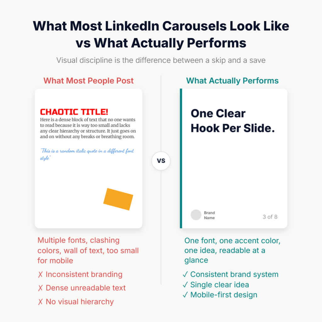
This is where most creators leave performance on the table. Content structure gets all the attention. Visual consistency is what builds a recognisable brand in the feed over time.
- Consistent brand visuals make your posts recognisable before anyone reads a word. Every carousel you publish should belong to the same visual system: the same background treatment, the same fonts, the same accent colours, the same layout grid. When someone sees your document post in their feed, they should know it is yours before they read your name. That recognition builds over time and directly reduces the effort required to earn a swipe from someone who has seen your work before.
- The LinkedIn feed is mostly blue and white. Bold, contrasting colours in your brand palette make your carousel visually distinct in a scroll that is otherwise homogeneous. You do not need loud or garish design. You need deliberate contrast with the visual noise around you.
- Keep the colour palette tight. The most credible-looking carousels use one or two accent colours against a clean base. Avoid gradients that compete with each other, neon highlights, or designs that try to use every colour in the brand toolkit at once. A restrained palette signals professionalism. A messy one signals that the content was thrown together.
- Design for mobile screens first. Most LinkedIn views come from mobile devices, and a slide that looks balanced on a desktop becomes cramped and unreadable on a phone. Use a vertical format at 1080x1350px or square at 1080x1080px. Keep fonts large enough to read at a glance on a small screen. Any text that requires zooming in will be ignored. The Contentdrips guide to LinkedIn carousel sizes covers the exact specifications and explains when to use each format.
- Data and numbers stop the scroll. A bold statistic in large type on a clean background is one of the most reliably attention-grabbing slide designs. LinkedIn audiences respond to specificity. “47% of B2B buyers” on a clean slide outperforms an abstract visual almost every time.
- Accessibility is not optional. High-contrast colour combinations, large type, and clean layouts are not just good design practices. They ensure that users with visual impairments can actually read and engage with your content, which in turn expands your effective audience.
The 5 LinkedIn Document Post Formats That Consistently Perform
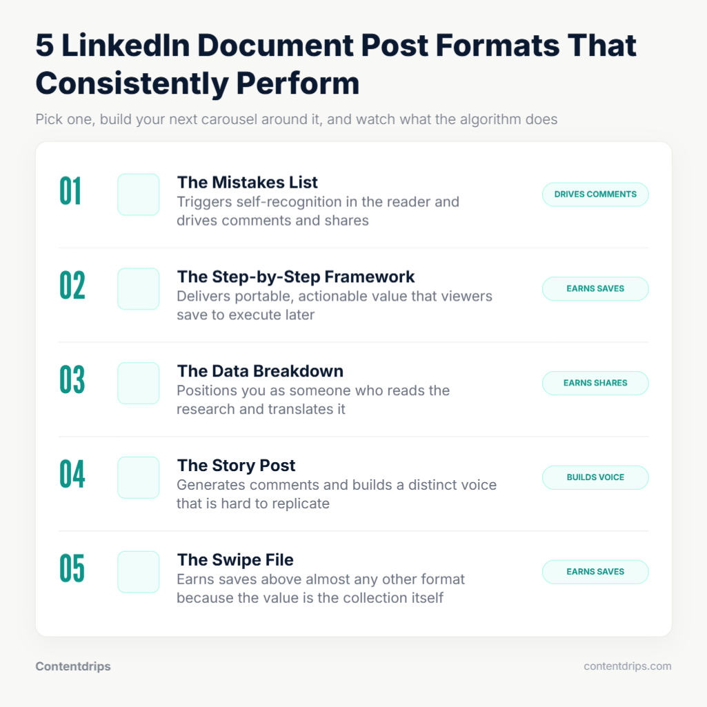
Not all document post topics are equal. These five formats show up repeatedly in high-performing carousels because they each satisfy something the LinkedIn audience is actively looking for.
- The “X Mistakes” List. This format works because it triggers recognition. Readers scroll through and identify their own errors in real time. The engagement comes from the combination of mild discomfort and actionable relief. “7 LinkedIn profile mistakes that are killing your reach” is a carousel that practically writes its own hook.
- The Step-by-Step Framework. Professionals come to LinkedIn to learn things they can apply. A numbered, action-by-action breakdown of how to do something specific delivers immediate, portable value. One step per slide, a clear outcome at the end. This format generates saves because people want to return to it when they are ready to execute.
- The Data Breakdown. Take a report, a study, or a dataset and visualise the most compelling numbers one per slide. This positions you as someone who reads the research and translates it. It earns trust and shares because readers forward it to colleagues who would find it useful.
- The “Here Is What I Learned” Story. Personal experience wrapped in a structured narrative. Slide one sets the stakes, the middle slides deliver the lessons, the final slide delivers the takeaway. This format generates comments because it invites reaction and disagreement. It is also the hardest to replicate, which is why it builds the strongest sense of a distinct voice.
- The Resource or Swipe File. A collection of tools, templates, links, or references on a topic, curated and formatted. This format drives saves more than almost any other because the entire point is that the viewer wants to keep it. “12 free tools for LinkedIn growth” as a document post will consistently outperform the same list as a text post.
How to Create a LinkedIn Document Post Without Spending Hours on It
The main reason creators avoid the document format is production time. Designing slides in Canva or PowerPoint from scratch takes 30 to 90 minutes. Doing it consistently, at a pace that builds momentum, is genuinely difficult without a system.
The practical workflow is to start from a template rather than a blank canvas.
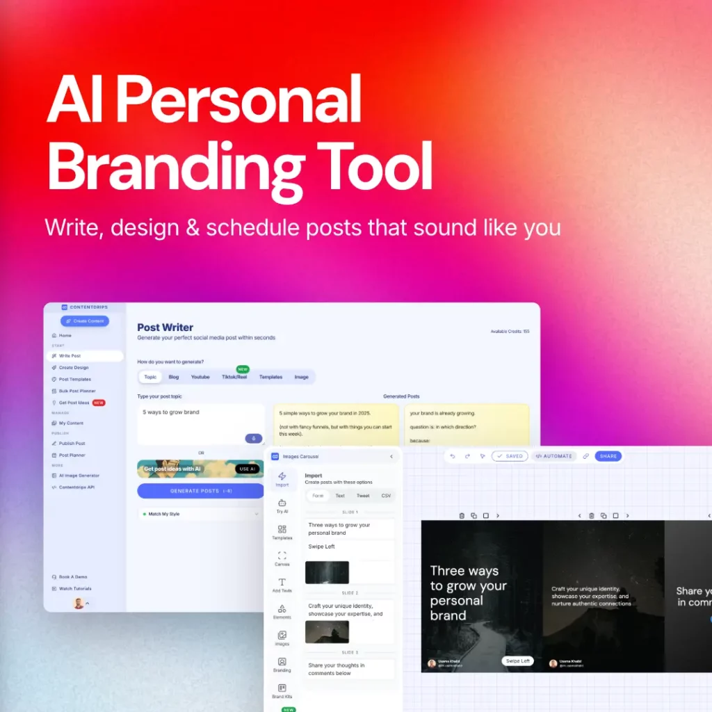
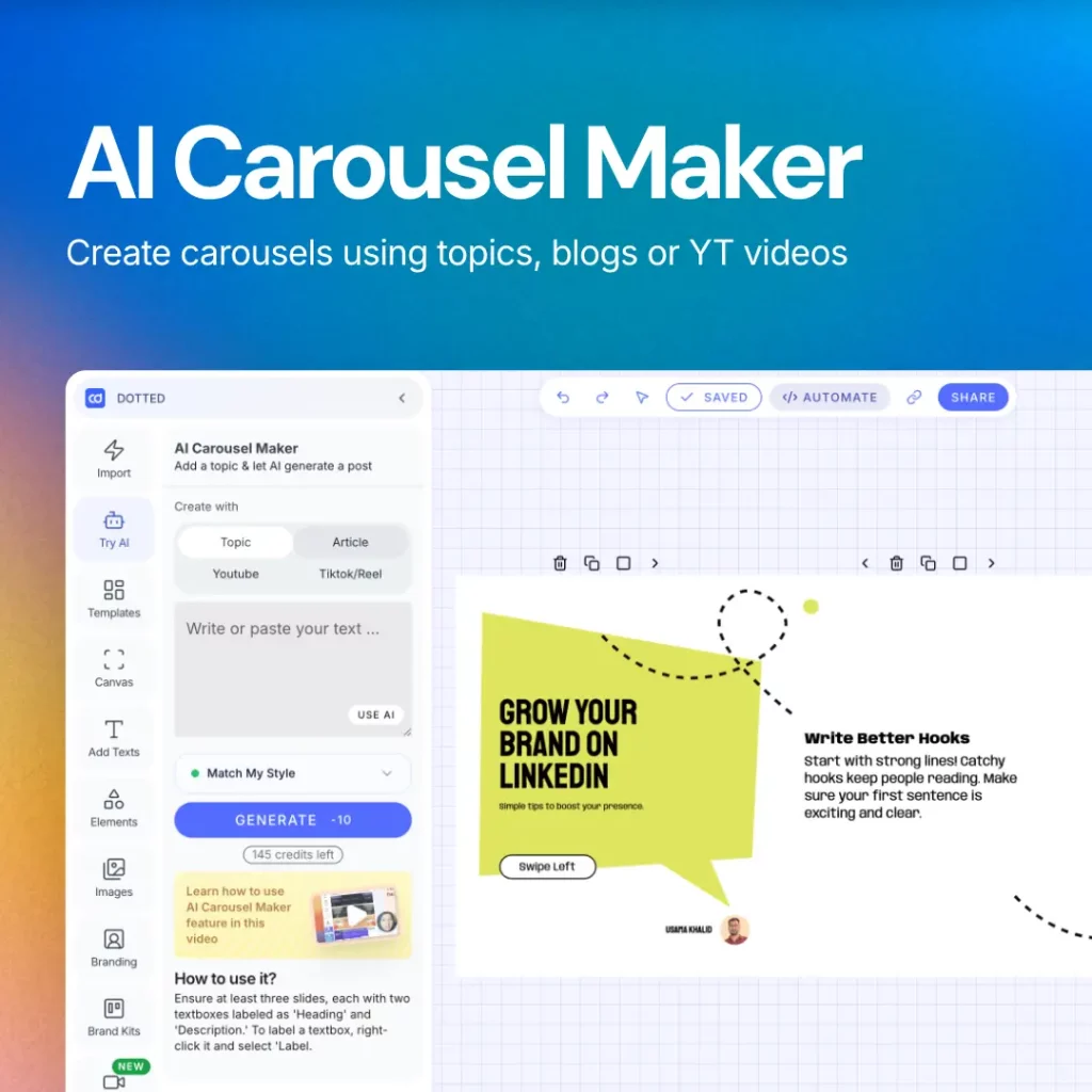
Contentdrips’ LinkedIn carousel generator lets you enter a topic, paste a blog URL, or drop in a YouTube link, and the AI generates a fully designed carousel: hook slide, value slides, CTA slide. It applies your brand kit automatically, so every carousel uses your fonts, colours, and logo without any manual re-styling. The output is a PDF sized correctly for LinkedIn at 1080x1350px, ready to upload directly as a document post.
For creators who prefer to start from a visual template and write into it, the Contentdrips template library has over 500 options organised by format type and use case. Pick one that fits the structure you are using, fill the content, and publish. No design decisions to make from scratch.
If you are working from existing written content like a blog post or a LinkedIn article, the blog-to-carousel repurposing workflow takes the same source material and reformats it into slides. One piece of long-form content becomes a complete carousel without rewriting everything from scratch.
For users who prefer to work through prompts, the Contentdrips AI Design Agent prompt library has 25 ready-to-use prompts for carousels, infographics, and listicles built for LinkedIn’s format requirements.
The production question is really a system question. Creators who post document posts consistently are not spending more time per post. They are spending less time per post because they stopped designing from zero every time.
Mistakes That Kill LinkedIn Document Post Performance
Understanding what works is half the job. Knowing what to avoid is the other half.
- Too many slides. More than 12 slides causes drop-off before the CTA slide. The goal is depth within the right range, not length for its own sake. Six to ten slides is the sweet spot for most formats.
- A weak first slide. Opening with “today I want to share something about…” is the fastest way to guarantee nobody swipes. The hook slide needs to earn attention immediately. If slide one does not create a reason to swipe, the rest of the carousel does not matter.
- Uploading as a link instead of a native document. Sharing a link to a PDF is not a document post. It is a link post, which LinkedIn actively penalises with reduced reach. The PDF must be uploaded directly using the document option when creating a post.
- Inconsistent slide design. If every slide looks like it came from a different template or colour palette, the carousel looks unprofessional and the brand recognition benefit disappears entirely. Visual consistency is what makes the format compound over time.
- No CTA on the final slide. A carousel that delivers value and then ends with nothing is a missed opportunity. Every document post needs a clear, specific action on the last slide. Tell the viewer exactly what to do next.
- Treating it like a presentation deck. Corporate slide decks are designed to be presented out loud, with a speaker filling in the context. A LinkedIn document post has to communicate entirely on its own. Bullet points, dense text, and slide titles that assume context do not translate. Write for a reader who is swiping silently on their phone.
Frequently Asked Questions About LinkedIn Document Posts
What is the difference between a LinkedIn document post and a carousel post? They are the same thing. A LinkedIn document post is the technical name for what most creators call a carousel. You upload a PDF file, LinkedIn converts each page into a slide, and the result is a swipeable, in-feed experience. The two terms are used interchangeably across the platform and in most content guides.
What file format should I use for a LinkedIn document post? PDF is the recommended format. LinkedIn also accepts DOC, DOCX, PPT, and PPTX files, but font rendering and layout shifts can occur during conversion. Exporting your slides to PDF before uploading gives you the most reliable and consistent result every time.
How many slides should a LinkedIn document post have? Six to ten slides is the sweet spot for most formats. Fewer than five slides tends to feel too short to justify the swipe commitment. More than twelve slides causes drop-off before viewers reach the CTA slide. The goal is enough depth to deliver real value, not enough length to exhaust the reader.
What size should each slide be? The recommended dimensions are 1080x1080px for square format or 1080x1350px for portrait format. Portrait takes up more feed space on mobile and is the preferred choice for most carousels. Square is a reliable fallback for data-heavy or chart-based slides. Both render cleanly on desktop and mobile without cropping.
Can I edit a LinkedIn document post after publishing it? You can edit the caption text, hashtags, and any typos in the post copy after publishing. You cannot swap out the PDF or change the slides once the post is live. If the document itself needs to change, the only option is to delete the post and repost with the corrected file.
Why is my document post getting low reach? The most common reasons are a weak first slide that fails to earn the swipe, uploading the PDF as a link rather than a native document, too many slides causing drop-off, or inconsistent visual design that signals low effort to the viewer. Posts with external links in the caption also receive significantly reduced reach from LinkedIn’s algorithm. If the caption includes a link to an external site, move it to the comments after posting.
Do document posts work for company pages as well as personal profiles? Yes, and the data actually shows strong performance for both. Personal profiles still outperform company pages significantly on overall reach, but document posts are the top-performing format for company pages specifically, with a higher reach multiplier than images, video, or text posts. If a company page is going to post anything, document posts give it the best chance of distribution.
How often should I post LinkedIn document posts? There is no fixed rule, but posting two to three document posts per week as part of a broader content mix is sustainable for most creators. Consistency matters more than frequency. A document post every week that is well-structured and on-brand will outperform an inconsistent burst of posts with no visual system behind them.
The Window Is Still Open
Most creators know document posts perform well. Almost none of them are posting them consistently. The gap between awareness and action is where the opportunity lives right now.
The format rewards dwell time, generates saves, and builds brand recognition at a pace that text posts and images simply cannot match. The algorithm is pushing it. The competition for attention in this format is still low.
The question is not whether LinkedIn document posts are worth doing. The numbers answered that. The question is whether you have a production system that makes posting them consistently realistic.
Contentdrips gives you that system. Start with one document post this week and see what the format does for your reach.