We analyzed 100+ LinkedIn carousels to build this guide. Most carousel advice tells you what to do. This one shows you exactly how — with real hook examples, 7 viral formats broken down slide by slide, and the design specs that determine whether LinkedIn pushes your post or buries it.
Why LinkedIn Carousels Go Viral (The Data First)
Before the tactics, the context. Here is why carousels are worth your effort in 2026.
According to Socialinsider’s 2026 benchmark study, LinkedIn carousels generate 3.7x more engagement than text-only posts and reach 1.8x more people than single-image posts. The reason is straightforward: LinkedIn’s algorithm measures dwell time. When someone swipes through 8 slides instead of scrolling past a single image in a second, the platform reads that as high-quality, valuable content and amplifies the distribution.
The algorithm also rewards saves and shares more than likes. Carousels that teach something useful get saved at much higher rates than any other format. Every save is a signal that drives more reach.
The result: a well-constructed carousel from an account with 2,000 followers can outreach a text post from an account with 50,000. Format matters that much on LinkedIn.
LinkedIn Carousel Specs and Sizes (2026)
Get these wrong and LinkedIn either won’t accept your file or your carousel will look blurry or cropped on mobile.
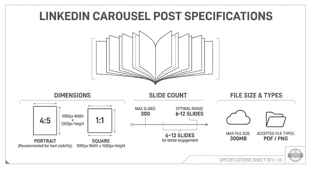
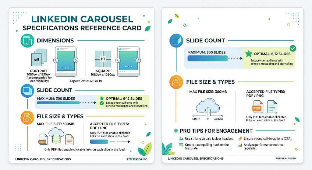
Dimensions
| Format | Dimensions | Best For |
|---|---|---|
| Portrait (recommended) | 1080 x 1350 px | Mobile-first viewing, maximum screen real estate |
| Square | 1080 x 1080 px | Cross-posting to Instagram |
| Landscape | 1920 x 1080 px | Data visualizations and presentations |
Portrait slides are the standard for a reason: over 75% of LinkedIn browsing happens on mobile. Portrait fills the screen. Square leaves white space. Carousels not optimized for mobile lose an estimated 75% of their potential reach.
Slide Count
- Maximum slides LinkedIn allows: 300
- Optimal range for reach: 6 to 12 slides
- Below 5 slides: reach drops approximately 35%
- Above 20 slides: reach drops approximately 25%
The sweet spot is 8 to 10 slides. Long enough to deliver real value. Short enough that people actually finish it.
File Format and Size
- Upload as a PDF (LinkedIn converts each page to a slide)
- Maximum file size: 300MB
- PNG or JPG works too but PDF is the cleaner production workflow
Font Sizes for Readability
| Element | Recommended Size | Notes |
|---|---|---|
| Heading | 80px | Never go smaller on the hook slide |
| Subheading | 55px | Use for slide titles in the body |
| Body text | 45px minimum | Anything smaller fails on mobile |
Going below 45px for body text is the single most common design mistake in LinkedIn carousels. It renders unreadably small on a phone screen.
The Anatomy of a Viral LinkedIn Carousel
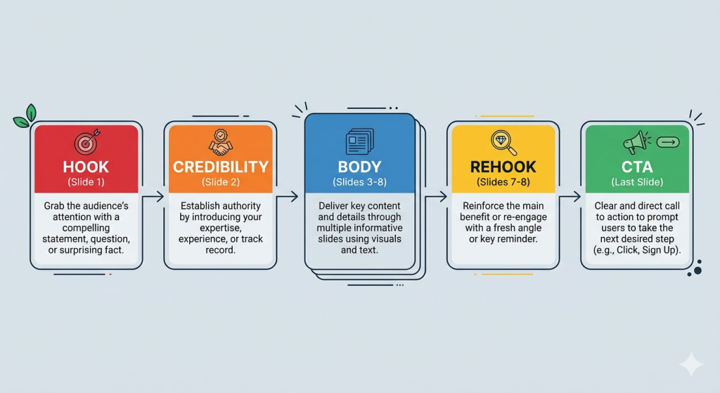
Every high-performing LinkedIn carousel follows the same underlying architecture. Here is each component with examples.
1. The Hook Slide (Slide 1)
The hook is the most important slide in your carousel. It determines whether someone swipes or scrolls past. It has one job: create enough curiosity or tension that stopping to read feels necessary.
What makes a hook work:
- It creates an information gap. The reader does not know what comes next but wants to.
- It challenges an assumption they hold. Cognitive dissonance stops the scroll.
- It names a specific outcome or number. Specificity signals credibility.
What kills a hook:
- Starting with “In this carousel I will share…”
- Generic claims: “Here are 5 tips to grow on LinkedIn”
- Questions with obvious answers
The hook formula that works: State or imply a surprising conclusion, then deny the explanation until slide 2.
2. The Credibility Slide (Slide 2)
Slide 2 is often overlooked but it does critical work. After the hook creates curiosity, the credibility slide answers: “Why should I trust this person?”
It does not have to be a brag. It can be as simple as: “I have tested this across 47 client accounts over 18 months.” Or: “This framework came from a mistake that cost me a $12,000 contract.”
One sentence establishing why you know this. Then move on.
3. The Body Slides (Slides 3 to 8)
The body delivers the promised value. Each slide should cover one idea, one step, or one point. No more.
Rules for body slides:
- 25 to 50 words per slide maximum. Anything more and people stop reading.
- One visual anchor per slide — an icon, a chart, an illustration, or a bold number.
- Short sentences. If a sentence runs more than two lines, cut it in half.
- Progress cues. A subtle slide number or progress bar keeps people swiping.
4. The Rehook (Mid-Carousel)
The rehook is a technique used by top carousel creators to re-engage readers who are starting to drift around slides 5 to 6. It does not add new information. It reminds the reader why the remaining slides are worth seeing.
Rehook examples:
- “The next two slides are the ones most people skip — and that’s exactly why they stay stuck.”
- “We are halfway through. Here’s where it gets counterintuitive.”
- “What I’m about to show you is why slide 8 is the one people screenshot most.”
One sentence. Creates a micro-commitment to finish.
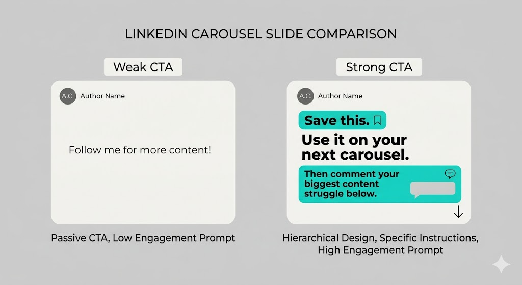
5. The CTA Slide (Last Slide)
The CTA slide determines whether your carousel generates engagement or just views. Most people waste it with “Follow me for more tips.” That is not a CTA. That is a dismissal.
A strong CTA does three things:
- Tells the reader exactly what action to take
- Explains the benefit of taking that action
- Lowers the friction as much as possible
CTA slide examples that work:
For engagement (saves and comments): “Save this post. Come back when you need to structure your next carousel. Then comment below: what’s your biggest struggle with LinkedIn content right now?”
For followers: “If this framework saved you 30 minutes of overthinking — follow me. I share one tactical post like this every Tuesday.”
For lead generation: “I built a free 5-slide carousel template with placeholder copy included. DM me the word TEMPLATE and I will send it over.”
For website traffic: “The full breakdown with the swipe file is at [URL]. Link in first comment.”
For reposts: “If this would help one person on your network — repost it. That is the only ask.”
The CTA slide design rule: Keep it visually simple. One instruction. Large text. A single contrasting accent color. Do not clutter it with five different options.
7 Viral LinkedIn Carousel Formats (Slide-by-Slide Breakdowns)
These are the seven carousel structures that appear most frequently in high-performing posts. Each breakdown includes the slide-by-slide structure, an example hook, and when to use it.
Format 1: The Problem-Solution-Result (PSR) Carousel
Best for: B2B founders, consultants, coaches, SaaS marketers
Optimal slides: 8 to 10
Why it works: It mirrors how buyers think. Problem creates identification. Solution creates hope. Result creates trust.
Slide-by-slide breakdown:
| Slide | Purpose | Example Content |
|---|---|---|
| 1 | Hook | “90% of sales teams are losing deals for this one reason.” |
| 2 | Credibility | “I have worked with 60+ B2B teams. This is the pattern I keep seeing.” |
| 3 | Problem | Name the exact pain. Be specific. |
| 4 | Agitate | Show the cost of the problem. Revenue lost, time wasted, deals missed. |
| 5 | Solution intro | “The fix is a single shift in how you frame every discovery call.” |
| 6 | Solution step 1 | One concrete, actionable step. |
| 7 | Solution step 2 | Second step. Add a visual or example. |
| 8 | Result | A specific outcome: “Close rate improved from 18% to 34% in 6 weeks.” |
| 9 | Rehook | “Here’s the script we use on slide 10.” |
| 10 | CTA | Ask for a comment, a save, or a DM. |
Example hook that got 3,200+ reposts: “Your cold emails are getting ignored. Not because of your subject line. Because of what you put in line 3.”
Format 2: The Numbered List Carousel
Best for: Listicles, tip compilations, resource roundups
Optimal slides: 7 to 12 (one tip per slide)
Why it works: People know exactly what they are getting. The number in the hook sets a clear expectation and creates a completion motivation.
Slide-by-slide breakdown:
| Slide | Purpose | Example Content |
|---|---|---|
| 1 | Hook | “7 LinkedIn myths that are killing your reach (that nobody talks about).” |
| 2 | Credibility | Brief context on why you know this. |
| 3–9 | One tip per slide | Bold number + tip heading + 2-sentence explanation |
| 10 | Summary | “Save this. You will need it next time you post.” |
| 11 | CTA | Comment prompt or follow ask |
Design tip: Put the number in a large accent color. The number is the visual anchor. Everything else supports it.
Hook variations that consistently perform:
- “[X] things I wish I knew before [common experience]”
- “[X] [role]-specific mistakes that cost people [specific loss]”
- “[X] frameworks every [target audience] should know (but most don’t)”
Format 3: The Step-by-Step Tutorial Carousel
Best for: How-to content, process explanations, skill building
Optimal slides: 8 to 12
Why it works: It satisfies the exact intent of “how to make carousel post on linkedin” and similar tutorial queries. It is also the format most likely to be saved and revisited.
Slide-by-slide breakdown:
| Slide | Purpose | Example Content |
|---|---|---|
| 1 | Hook | “How I create a LinkedIn carousel in 45 minutes flat. Here’s the exact process.” |
| 2 | Overview | “5 steps. Start to finish. No fancy tools required.” |
| 3 | Step 1 | With a screenshot or visual illustration |
| 4 | Step 2 | Each step gets its own slide |
| 5 | Step 3 | |
| 6 | Step 4 | |
| 7 | Step 5 | |
| 8 | Common mistake | “Most people skip this step and wonder why their carousels don’t convert.” |
| 9 | Result | “When I followed this, my average saves went from 12 to 140 per carousel.” |
| 10 | CTA | “Save this for your next carousel. Then comment: which step trips you up most?” |
Format 4: The Before-and-After Carousel
Best for: Transformation stories, case studies, skill demonstrations
Optimal slides: 6 to 8
Why it works: Contrast is one of the most powerful persuasion tools available. The gap between before and after creates desire. The reveal creates satisfaction.
Slide-by-slide breakdown:
| Slide | Purpose | Example Content |
|---|---|---|
| 1 | Hook | “I rewrote this LinkedIn profile. Here’s the before and after.” |
| 2 | The Before | Show the unoptimized version. Be blunt about what is wrong. |
| 3 | Why it fails | One slide diagnosing the core problem. |
| 4 | The Transformation | Walk through the specific changes made |
| 5 | The After | Show the result side by side if possible |
| 6 | The Numbers | “Applications up 340% in 6 weeks. 4 inbound recruiter calls in the first month.” |
| 7 | Your take | Key lesson extracted from the transformation |
| 8 | CTA | “Want me to critique your profile? Comment REVIEW below.” |
Format 5: The Data Story Carousel
Best for: Researchers, analysts, consultants, anyone with access to original data
Optimal slides: 8 to 12
Why it works: Data carousels get saved at dramatically higher rates than any other format because they function as reference material. Every save is a reach multiplier.
Slide-by-slide breakdown:
| Slide | Purpose | Example Content |
|---|---|---|
| 1 | Hook | “I analyzed 1,000 LinkedIn carousels. Here’s what actually drives reach.” |
| 2 | Context | Study size, methodology, timeframe |
| 3–8 | One data point per slide | Large number + one-line insight + chart or icon |
| 9 | The surprising finding | “The counterintuitive result: shorter carousels outperformed longer ones by 40%.” |
| 10 | What this means for you | Practical takeaway |
| 11 | CTA | “Save this report. Share it with anyone who creates content on LinkedIn.” |
Hook formula for data stories: “I [analyzed / studied / tracked] [specific number] [subject]. Here’s what the data actually shows.”
Format 6: The Contrarian Take Carousel
Best for: Thought leaders, established creators, anyone with a credible dissenting view
Optimal slides: 7 to 9
Why it works: Disagreement is the highest-engagement trigger on LinkedIn. A well-argued contrarian carousel generates comments from both sides — which tells the algorithm it is creating conversation worth amplifying.
Slide-by-slide breakdown:
| Slide | Purpose | Example Content |
|---|---|---|
| 1 | Hook | “Everyone says post every day on LinkedIn. I think that’s wrong. Here’s why.” |
| 2 | Acknowledge the consensus | Show you understand the other side before you challenge it |
| 3 | Your counter-argument | State your actual position clearly |
| 4–6 | Three supporting points | Each with a specific example or data point |
| 7 | The caveat | “This is not true for everyone. Here’s when daily posting actually makes sense.” |
| 8 | CTA | “Agree or disagree? Comment below. I read every reply.” |
Important: The caveat slide is not optional. A contrarian carousel without a caveat comes across as arrogant. The caveat shows intellectual honesty and disarms critics before they comment.
Format 7: The Personal Story Carousel
Best for: Founders, creators, coaches, anyone building a personal brand
Optimal slides: 6 to 9
Why it works: Stories have the highest share rate of any carousel format on LinkedIn. Vulnerability drives reposts. Specificity drives saves.
Slide-by-slide breakdown:
| Slide | Purpose | Example Content |
|---|---|---|
| 1 | Hook | A moment of tension or failure that your audience will recognize |
| 2 | The setup | Context: where you were, what you believed, what happened |
| 3–5 | The story | One moment per slide. Present tense makes it more vivid. |
| 6 | The turning point | “That conversation changed everything I thought I knew about [topic].” |
| 7 | The lesson | Extract one clear, transferable insight from the story |
| 8 | The invitation | “Has this happened to you? What did you do? Comment below.” |
Story hook formulas that perform:
- “Two years ago I [embarrassing failure or mistake]. Here’s what I learned.”
- “I almost quit [thing] in [year]. This is why I didn’t.”
- “Nobody told me [unexpected truth] when I started [journey]. So I’m telling you.”
(IMAGE_PROMPT=### Visual summary showing 7 carousel format cards in a 2×4 grid (with one spanning full width at bottom): Problem-Solution-Result, Numbered List, Step-by-Step Tutorial, Before-and-After, Data Story, Contrarian Take, Personal Story. Each card shows the format name, ideal use case, and optimal slide count. Clean card layout, Contentdrips blue accent.)
30 LinkedIn Carousel Hook Examples That Stop the Scroll
The hook is 80% of your carousel’s performance. These 30 examples are organized by psychological trigger. Use them as starting points, not templates to copy verbatim.
Curiosity gap hooks:
- “The counterintuitive reason your LinkedIn posts are not getting reach.”
- “Most LinkedIn advice is wrong. Here is what the data actually shows.”
- “I discovered this by accident. Now I use it every single time.”
- “Nobody talks about this. But it is responsible for 80% of my carousel reach.”
- “What happens to your LinkedIn algorithm rank when you post every day. (It is not what you think.)”
Number and specificity hooks: 6. “7 LinkedIn myths that are costing you reach right now.” 7. “I analyzed 1,000 LinkedIn carousels. Here are the only 3 things that matter.” 8. “5 carousel hooks that drove 10,000+ impressions. Slide 3 was the surprise.” 9. “This one formatting change increased my saves by 340%.” 10. “I spent 90 days testing LinkedIn formats. The results were not what I expected.”
Failure and vulnerability hooks: 11. “I posted on LinkedIn every day for a year. Here’s what I got wrong.” 12. “My worst-performing carousel got 200 impressions. My best got 280,000. Here’s the difference.” 13. “Two years ago I almost deleted my LinkedIn. Here’s what changed.” 14. “I made every carousel mistake in the book. So you don’t have to.” 15. “The carousel I was most proud of flopped. The one I almost didn’t post went viral.”
Authority and credibility hooks: 16. “After creating 300 LinkedIn carousels, here is what I know for certain.” 17. “I have worked with 40+ creators to grow their LinkedIn. The pattern is always the same.” 18. “I used to write for X before starting my own thing. Here is what big media taught me about hooks.” 19. “I grew from 500 to 50,000 LinkedIn followers using one format. Here’s the template.” 20. “Our agency manages LinkedIn for 12 B2B companies. Here’s what works in 2026.”
Contrarian and challenge hooks: 21. “Stop optimizing your LinkedIn profile. Do this instead.” 22. “Your carousel is too long. Here’s how I know.” 23. “Everyone is posting carousels wrong. Including most LinkedIn coaches.” 24. “The most overrated LinkedIn advice (and what actually works instead).” 25. “Posting daily on LinkedIn is not a growth strategy. It is a distraction.”
Urgency and timeliness hooks: 26. “The LinkedIn algorithm changed again. Here’s what that means for carousels in 2026.” 27. “Most of what worked for LinkedIn carousels in 2024 is now actively hurting your reach.” 28. “If you are still using this carousel format, your reach is probably declining. Here’s why.” 29. “LinkedIn just changed how it ranks carousel posts. Here’s what the new rules are.” 30. “The window for this carousel format is closing. Here’s how to use it while it still works.”
Design Rules That Directly Impact Reach
These are not aesthetic preferences. Each of these rules has a measurable impact on whether people finish your carousel.
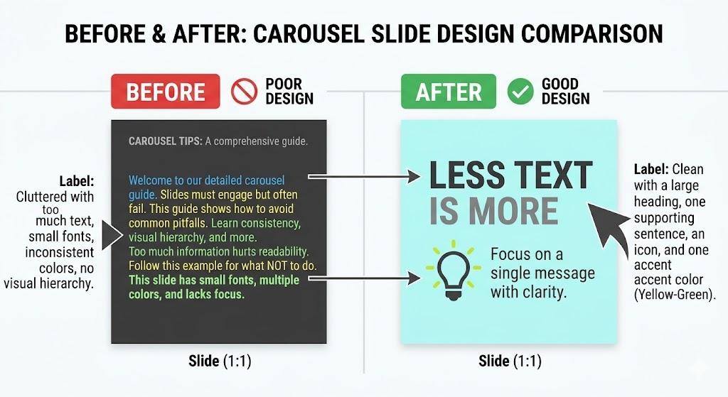
1. One idea per slide, maximum If you are writing a second paragraph on a slide, you have two slides. Split them. The moment a slide requires scrolling or mental effort to parse, people stop swiping.
2. High contrast is non-negotiable Dark text on dark background, or light text on light background, gets skipped on mobile. Check every slide on your phone before publishing. If you squint, so will your audience.
3. Use 1 to 3 colors only More than three colors signals amateur design. A consistent palette signals credibility. Your brand color + one neutral + one accent is the standard formula.
4. Leave white space Cluttered slides reduce reading speed. White space is not wasted space. It is what makes the important elements visible.
5. Use visuals, not just text Slides with only text reduce reach by 15 to 25% compared to slides that pair text with an icon, chart, or illustration. You do not need custom illustrations. A simple relevant icon is enough.
6. Vertical slides for mobile 1080 x 1350px portrait fills a phone screen. 1080 x 1080px square leaves bars at top and bottom. The extra screen real estate from portrait increases the chance someone stops scrolling.
How to Create a LinkedIn Carousel Post: Step by Step
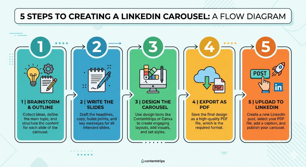
Step 1: Choose your format and outline the slides Pick one of the 7 formats above. Write a one-line purpose for each slide before designing anything. Your outline is: Hook / Credibility / Slide 3 purpose / Slide 4 purpose … / Rehook / CTA.
Step 2: Write the copy first Do not open a design tool until every word is written. Designing around bad copy is the most common carousel time-waster. Write in a Google Doc or Notion. Get every slide down to 25 to 50 words before you touch a template.
Step 3: Design the carousel Use a carousel maker that lets you apply your branding consistently. The fastest workflow is: pick a template that matches your brand, drop in your copy, export as PDF.
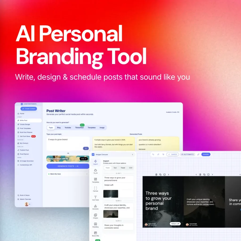
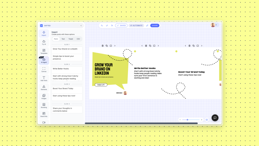
Contentdrips has a library of LinkedIn carousel templates built for 1080 x 1350px portrait format. You can import your copy directly, apply your brand kit, and publish to LinkedIn in one workflow.
Step 4: Write the accompanying post caption Your caption is not a summary of the carousel. It is a second hook that gives people who see the post preview a reason to open it. Optimal length: 1,200 to 1,500 characters. End with a question that invites a comment.
Step 5: Upload and post On LinkedIn, click the media icon in the post composer and upload your PDF. LinkedIn converts each page to a carousel slide automatically. Add a compelling first-line caption, include relevant tags but avoid hashtag stuffing, and post.
Step 6: Engage in the first 30 minutes The first 30 minutes after posting is the highest-leverage window for reach. Reply to every comment. Like every reaction. The algorithm interprets early engagement as a quality signal and shows the post to more people.
The Accompanying Caption Formula
Your caption needs to do two things: earn the open and earn the engagement. Here is the formula:
Line 1 (hook): A single bold statement that echoes the carousel hook but from a different angle. “Most people underestimate how much the first slide matters.”
Lines 2 to 4 (context): Two to three sentences that give just enough context to create interest without giving away the carousel content.
Line 5 (open loop): Create a gap between what they know and what the carousel will tell them. “What I found in slide 6 still surprises me.”
Line 6 (CTA): A specific question that makes commenting easy. “Which of these formats have you tried? Drop a number below.”
Optimal caption length: 1,200 to 1,500 characters. Longer captions have more weight with the algorithm. Too short signals low effort.
Create Your Next Viral Carousel in Minutes
Knowing the structure is half the battle. The other half is execution speed. The more friction in your production workflow, the less often you post.
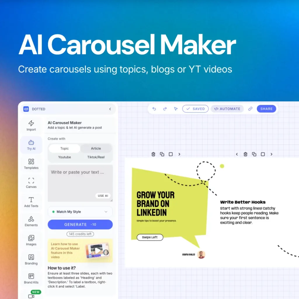
Contentdrips turns any topic, blog post, or YouTube video into a fully designed LinkedIn carousel in under two minutes. AI writes the slide copy in your voice. You pick a template, apply your brand kit, and export or publish directly to LinkedIn. No design skills needed.
Start creating carousels for free — No credit card required.
Frequently Asked Questions
How many slides should a LinkedIn carousel have? The optimal range is 6 to 12 slides for maximum reach. Below 5 slides, reach drops by roughly 35%. Above 20 slides, reach drops by roughly 25%. The sweet spot for most content types is 8 to 10 slides.
What size should a LinkedIn carousel be? Use 1080 x 1350px (portrait) for mobile-first viewing. This fills the phone screen and gives you more real estate than the 1080 x 1080px square format. Upload your carousel as a PDF.
How do you post a carousel on LinkedIn? Click the media icon in the LinkedIn post composer, upload your PDF file, and LinkedIn automatically converts each page into a carousel slide. You can add a caption before posting.
What is the maximum number of slides in a LinkedIn carousel? LinkedIn allows up to 300 slides, but performance data shows you should stay between 6 and 12 for maximum reach.
Why is my LinkedIn carousel not getting reach? The most common reasons are: the hook slide is too generic, the carousel has too few or too many slides, the design is text-heavy without visuals, the accompanying caption is too short, and the post has no CTA that drives saves or comments.
What is a carousel hook on LinkedIn? A carousel hook is the first slide of your carousel. Its only job is to stop the scroll and make someone want to swipe to slide 2. Strong hooks create curiosity gaps, challenge assumptions, or state a specific counterintuitive result.
What should a carousel CTA slide say? A strong CTA slide gives one clear instruction, explains the benefit of doing it, and lowers the friction. Examples: asking for a save, prompting a specific comment, offering something for a DM, or asking for a repost. Avoid vague CTAs like “Follow me for more.”