LinkedIn is currently one of the best platforms for businesses and professionals to reach their target audience organically. While other social media networks are becoming increasingly difficult to get noticed due to algorithm changes and the increasing prevalence of paid advertising, LinkedIn remains a platform where organic reach is still possible.
One of the key ways that businesses and individuals are able to achieve this organic reach on LinkedIn is through the use of carousel posts. LinkedIn refers to carousel posts as “document uploads,” and they allow users to share multiple visuals.
However, it’s important to follow best practices in order to get the most out of your LinkedIn carousel posts. Here are the top 5 best practices to follow:
1. Keep it short and sweet
LinkedIn users have short attention spans, so it’s important to keep your carousel posts concise and to the point. Aim for 3-5 slides in each carousel, and use clear and concise headlines and captions to explain each slide. Don’t add too much text on slides. Focus more on readability.
2. Importance of the first slide
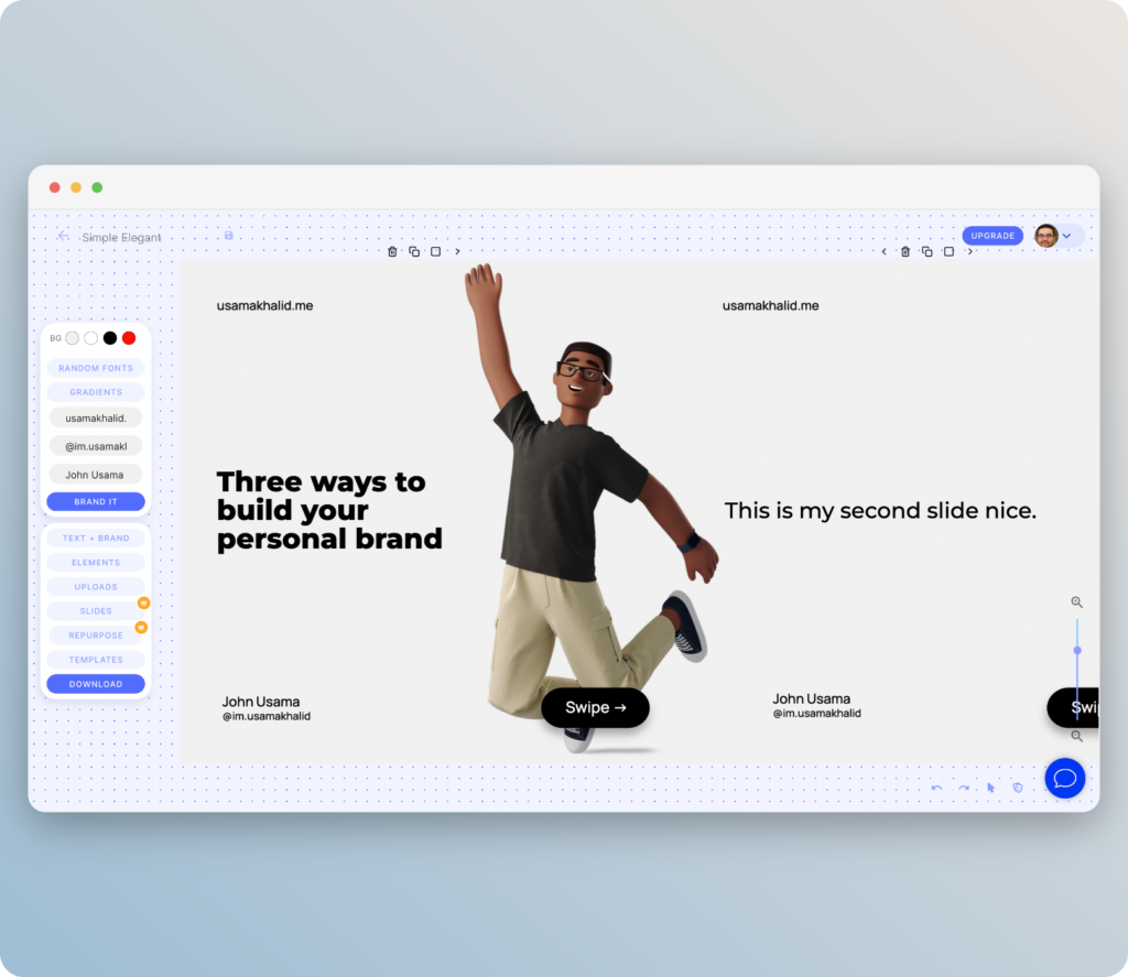
The first slide of your carousel is extremely important. It should be concise and engaging, with the goal of making users want to swipe left to see the second slide. Use the first slide of your carousel to draw your audience in with a question, outcome, or striking fact, and leave something incomplete to make them want to swipe to the second slide. The second slide should then complete the thought or idea presented in the first slide.
For e.g.
- “I went from 0 to [result]”
- “I’ve read x books on this [topic]. This is what it taught me”
- “Stop doing [process], instead do this [this]”
- “I’ve made this make. Here’s what I learned”
In terms of visual: A strong visual on the right side of the slide can help draw the eye and keep users interested. Be sure to explicitly mention that users should “swipe left” to continue reading, as this will help increase engagement with your post.

3. Use high quality images
The images you use in your carousel posts are the first thing that users will see, so it’s important to use high-quality, visually appealing images that are relevant to your message. Avoid using blurry or pixelated images, and make sure that the images are properly lit and in focus.
4. Tell a story.
One of the biggest advantages of carousel posts is that they allow you to tell a story or to showcase different aspects of your business. Use the carousel format to your advantage by creating a narrative that engages your audience and keeps them swiping left. Your content on each slide should be linked to the next slide.
If there is a step by step procedure, any listicle, or something text heavy. Carousel is such a great type of post.
5. Use a strong call to action.
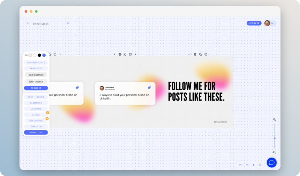
Your carousel posts should always include a call to action, whether it’s “Comment Below,” “Follow me for more content like this,” or “Share your thoughts in comments below” Make sure to include a clear and compelling call to action on the final slide of your carousel, so that users know what to do next.

Conclusion
As with any content on LinkedIn, it’s important to test and optimize your carousel posts to see what works best for your audience. Use LinkedIn’s analytics to track the performance of your carousel posts, and try out different headlines, images, and calls to action to see what gets the most engagement.
By following these best practices, you can create LinkedIn carousel posts that are engaging, visually appealing, and effective at driving traffic and conversions. Start experimenting with carousel posts today and see how they can help you reach and engage with your target audience on LinkedIn.
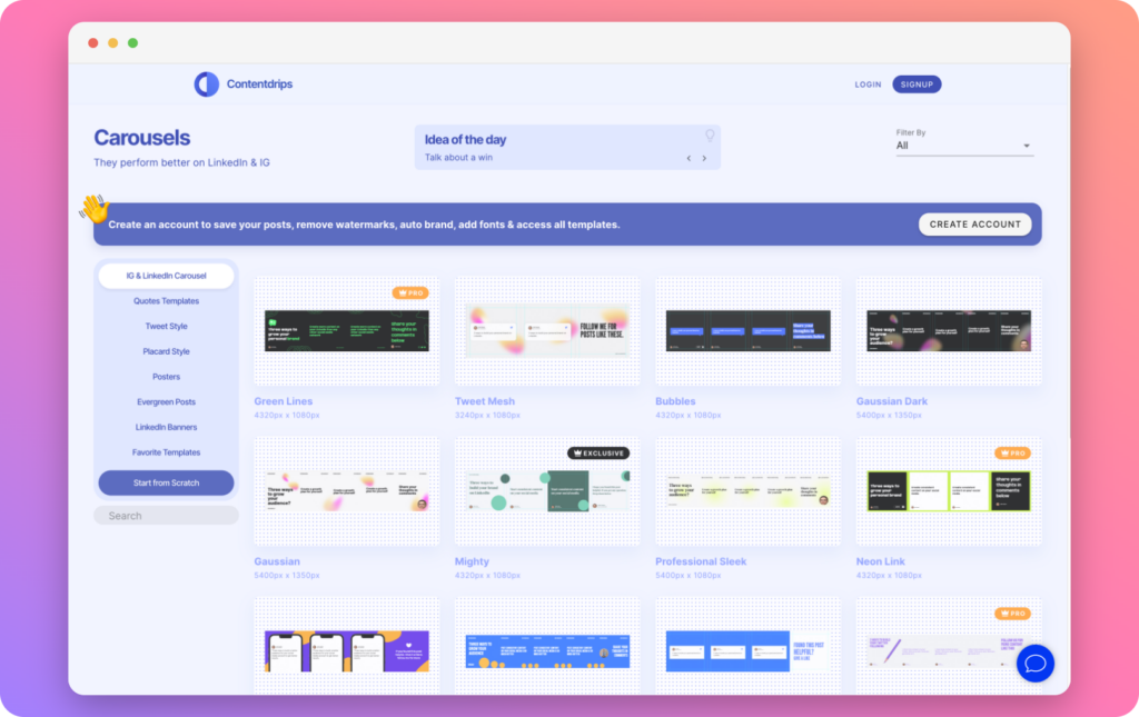
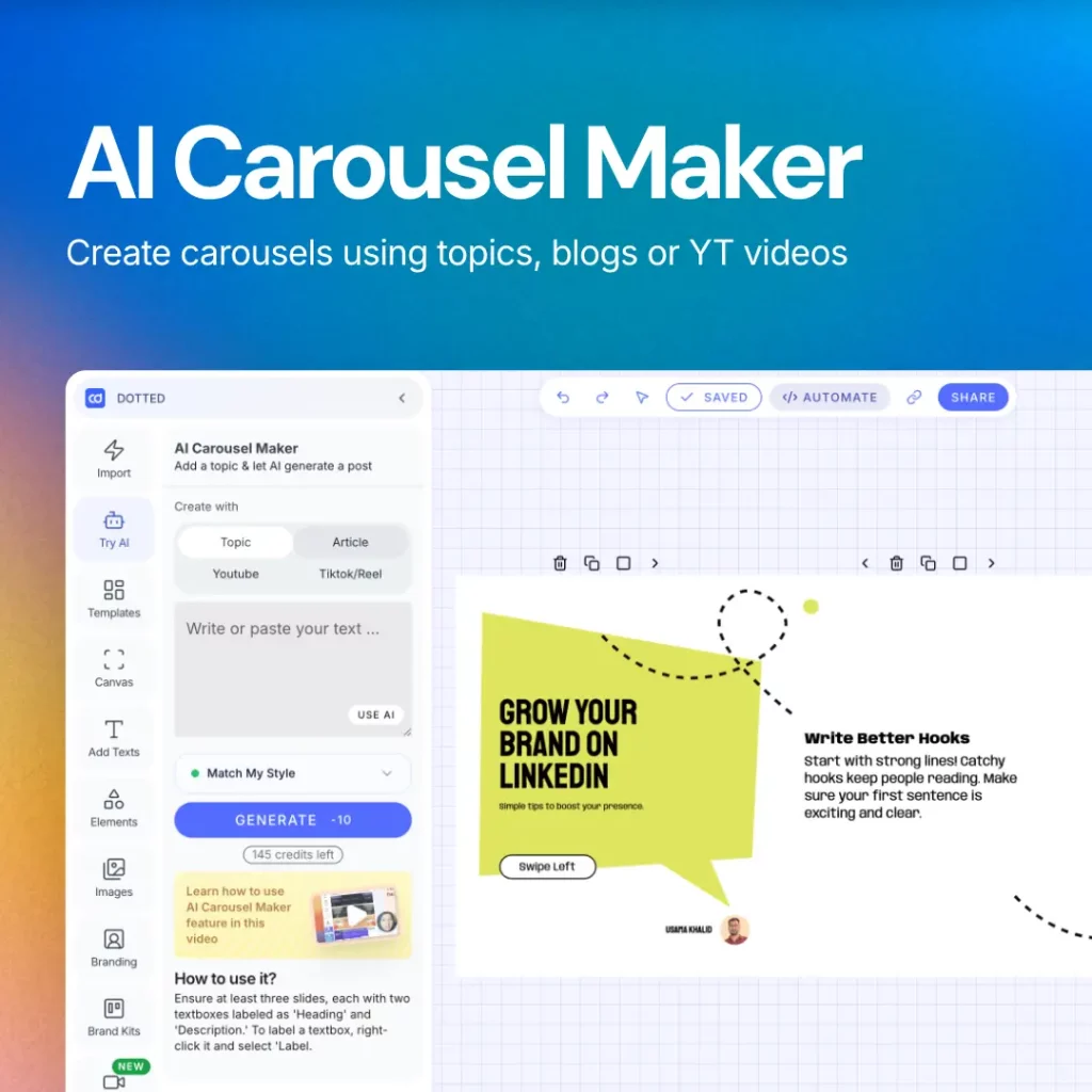
Templates are great way to get started on Linkedin carousel. Contentdrips have hundreds of LinkedIn carousel templates that you can use within your browser. You can make your edits and add your branding with just one click. It’s designed for LinkedIn.


