Are you struggling to get noticed on LinkedIn? Standing out on this social media platform can be a challenge.
Whether you’re looking to grow your professional network, establish your brand, or promote your business, engagement is key to success on LinkedIn.
And that’s where carousel templates come in. Carousels are a powerful way to showcase your content and capture your audience’s attention.
In this blog, we’ll explore the benefits of carousel templates with some examples of successful carousel templates.
By the end of this post, you’ll have the knowledge you need to create engaging carousel templates and take your LinkedIn engagement to the next level.
What are carousel posts?
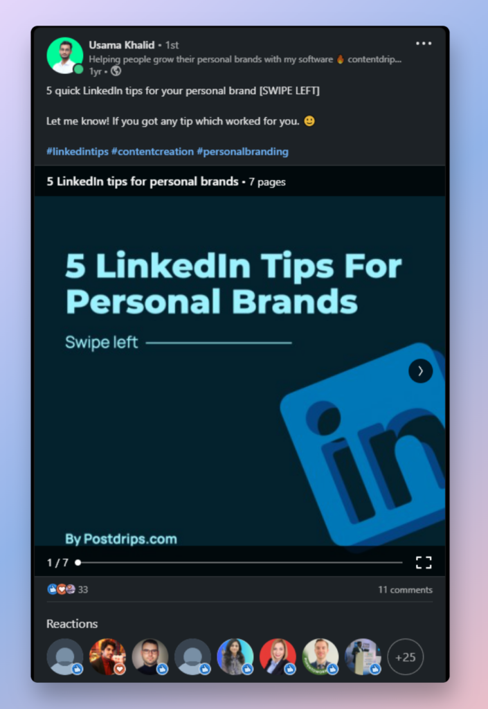
If you don’t already know, A carousel post is a way of including multiple images or videos in a single, which is then displayed as a swipe-able series of panels.
They allow you to tell a visual story or share multiple ideas within a single post. Which can help you stand out on LinkedIn and increase your engagement with your audience.
By using carousel posts, you can add variety and creativity to your LinkedIn content strategy, and potentially reach a wider audience

Importance of carousel posts
Carousels have an interactive format that keeps viewers engaged and encourages them to swipe through to see all the content.
This can be especially useful for longer-form content, such as product demos or customer case studies. By breaking up the content into bite-sized pieces, you can keep your audience engaged and interested in what you have to say.
Tips for creating effective carousel templates
To create effective carousel templates on LinkedIn, It’s essential to approach the task thoughtfully and pay attention to the details. Here are some tips to help you create efficient carousel posts:
- Start with a clear idea: Before creating a post it’s important to define your goal or message.
- Keep your audience in mind: It’s important to know your audience and understand their interests and preferences. By creating content that speaks directly to your audience.
- Consistent branding: Reinforce your brand identity, use consistent colors, fonts, and imagery across all the cards in your carousel to create a cohesive look.
- Use high-quality visuals: Use high-resolution images or videos to make your content look professional and more visually appealing to viewers.
- Use clear headlines and text: Use short, punchy headlines and keep your text concise to make your content more scannable and easy to read.
- Optimize for mobile: Use legible fonts, keep your text short, and use high-contrast colors because the majority of LinkedIn users access the platform on their mobile devices.
To recap
By presenting content in an interactive and visually appealing format, carousel templates can help you capture the attention of your audience and keep them engaged.
To create effective carousel templates it’s important to have a clear goal or message in mind, keep your audience in mind, use consistent branding and high-quality visuals, and optimize for mobile.
Follow these tips and create carousel templates that are both visually stunning and effective.
As you start experimenting with carousel templates, remember that engagement is key to success on LinkedIn.
By creating content that resonates with your audience and encourages interaction, you can build a strong following and increase your reach on the platform.
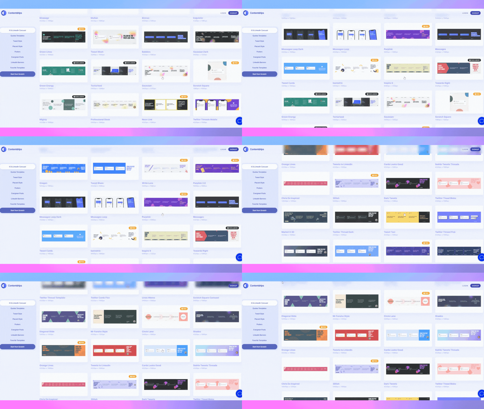
If you’re looking to get started on carousels, templates are the best way to go. Contentdrips offers a wide selection of templates that can be tailored to your needs and preferences. With hundreds of options to choose from.

Contentdrips templates
Contentdrips can provide a helpful starting point for creating engaging and visually appealing carousel posts
We encourage you to try out different formats and styles of carousel templates and see what works best for your audience.


