LinkedIn is amongst the most effective platforms to acquire quality content and connect with the leads in the industry. With over 722+ million members, currently, the platform provides massive exposure to brands and enables B2B marketers to gather up to 50% of their total social media traffic for their respective websites and blogs. Today we will discuss about LinkedIn carousel post.
According to statistics, it is also ranking on top in the social media platforms used by the top 500 Fortune companies, including Amazon, Microsoft, Unilever, Facebook, Nestle, etc. Naturally, the extensive global usage of LinkedIn calls for your attention if you or your brand struggles to gain recognition.
Here in this post, we will identify and uncover the top five table-turning elements of a game-changing marketing tool for this very platform, i.e., LinkedIn carousel post. Read on to figure how you can ace the game.
Follow AIDA plan

The AIDA Plan is one of the most successful marketing strategies used both digitally and physically. Fundamentally, AIDA stands for four primary principles of marketing:
- Attention
- Interest
- Desire/Details
- Action
Add an attention-grabbing element to your first slide to make them stop by. Next, develop interest by adding answers about why something is important or significant.
Third, provide details, i.e., your key message. Lastly, ask your audience to take action. It could be saving the post, downloading something, or directing them elsewhere.
These principles work together to turn your viewers into real-time followers.
Say you’re designing a 10-slide LinkedIn carousel post, the ideal ratio for AIDA distribution 1:5:3:1 in sequence.
Check out this video by Chris Do regarding carousel post. It works for Instagram & LinkedIn both.
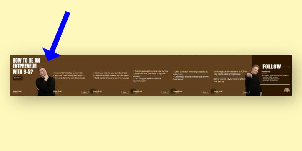
Add your photo to the first slide.

The purpose of a carousel post is to convert static text into appealing visual data that makes your audience stay longer than usual. It aims to grab attention and maximize the effectiveness of your say.
Naturally, you’d be rendering both these elements useless if you cannot add a touch of authenticity. You need to take your audience under confidence and make them believe that the content they’re currently reading comes from a genuine, qualified, or experienced individual. You ought to convey that the content of this carousel post is not computer-generated or something generic.
But how to do that? Will that require some rigorous procedures? Of course, not.
It’s pretty simple: step out in the front. Use your picture in the very first slide of the carousel post, so your audience knows that it’s you who says so. Trust me; it scales up their trust and appreciation of the post substantially.
Ask the reader to swipe right

Well, this element is simple yet quite very influential. Imagine designing a 10-slide carousel post only to have your reader read the first one and scroll down even though your post genuinely interested them.
So, what exactly went wrong?
Nothing big. You probably just missed a tiny but powerful CTA, i.e., swipe right. Your reader assumed it’s only one slide and moved on. No one’s got the time to run experiments and check if there are slides or not. So, be vocal about your content and let them know there’s more to read in the stated direction.
Choose better visuals

Again, the purpose of any carousel post is to convey your say visually. It’s much more interesting than reading a block of text and time-saving.
So, when designing your carousel post for LinkedIn, ensure that it uses an appealing color scheme. Corresponding the color scheme with your brand profile or identity is always a plus. It will make your feed look more professional and organized. As for the images, use copyright-free, original ones.
Provide a ton of value

Lastly, but perhaps most importantly, put up content of value and relevance in your LinkedIn carousel post. Do your research, conduct surveys, dive deep into the subject, verify as many times as need be, and compile together reliable and useful data.
By the term useful, I refer to content that is of direct value to your reader. For example, if you manufacture a product and discover that a certain relevant material is present in abundance at a cheaper rate (which probably the others do not know yet). Now there’s no point mentioning facts and figures of your discovery process. Instead, use your carousel post to convey how and why your audience should consider it. What are the ways of acquiring the material? What are its benefits?
I know. That’s quite an atypical example. But well. You get the idea. Don’t you?
Also, keep the text as precise as possible. About 1-2 short sentences per slide are enough.
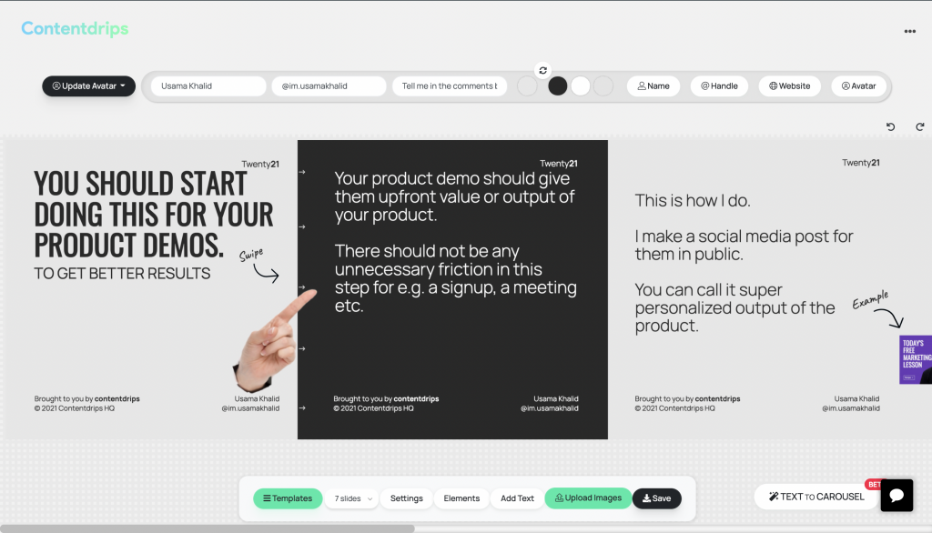
With that said, let’s wrap it up. All five essential elements are now in your knowledge, and Contentdrips is always at your service, bringing trailblazing carousel templates within your reach. I truly hope you make the best of both.


