You spent two hours building that carousel. The slides look clean, the topic is solid, you wrote a caption you were proud of. You hit publish and waited.
600 views.
Meanwhile the text post you typed in five minutes while waiting for coffee pulled in 6,000.
If this sounds familiar, you are not imagining it and you are not bad at this. Something specific is going wrong, and it is almost never the thing people blame first. It is rarely “my niche is too small” or “LinkedIn hates me.” It is one or two mechanical issues that are completely fixable once you know where to look.
This is a diagnostic, not a list of generic tips. We are going to walk through every reason a carousel quietly underperforms, grouped by where in the process it breaks down. Run your last few carousels against this and you will likely find your answer in the first few sections.
First, understand what LinkedIn is actually measuring
LinkedIn does not give carousels a special boost because they are carousels. It rewards three things: how long someone spends with your content (dwell time), whether people comment in a way that signals a real conversation, and whether people save the post for later. Carousels tend to win because swiping through slides naturally produces dwell time. But that only happens if the carousel actually earns the swipe and holds attention once it has it.
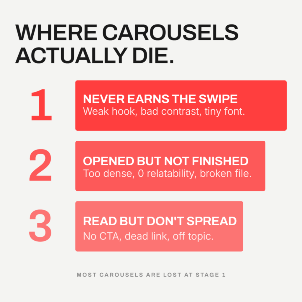
So when a carousel underperforms, it is failing at one of three stages: it never gets opened, it gets opened but nobody finishes it, or it gets read in full but still does not spread. Every cause below fits into one of those three buckets.
Bucket A: It never earns the swipe
This is the silent killer. If people scroll past slide one, nothing else about your carousel matters.
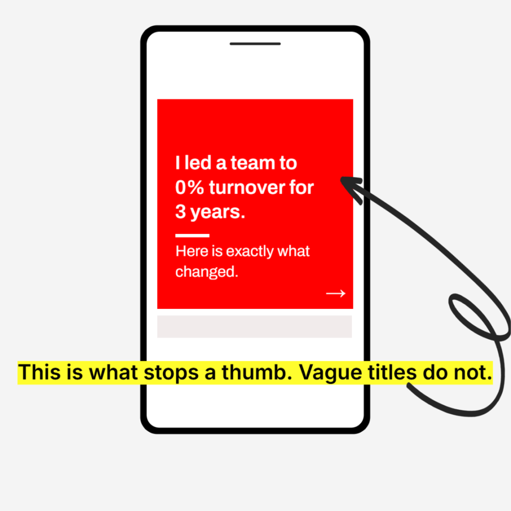
Slide 1 doesn’t earn the swipe. Your cover slide is the only thing most people see before deciding whether to engage. It has about two seconds to make a case for itself. A vague title like “My thoughts on leadership” gives someone no reason to swipe. A specific claim, a surprising number, or a question that creates real curiosity does the opposite. If your hook does not make someone curious enough to tap, you never get the dwell time that triggers wider distribution in the first place. This single slide is doing more work than the other nine combined.
The design fights the eye instead of helping it. This one gets overlooked constantly. A carousel can have a great hook and still die here. If your color choices are low contrast, your background is busy, or the palette is genuinely uncomfortable to look at, people feel the friction before they consciously register why. They do not think “the contrast ratio is off.” They just scroll past. Dark gray or black text on a light background, or white text on a dark background, is the safe and proven choice for a reason. Save the bold color experiments for places where reading speed does not matter as much.
The font size was built for a monitor, not a phone. Over 60 percent of LinkedIn sessions happen on mobile. A font size that looks perfectly comfortable on your 27 inch design monitor can shrink down to something genuinely hard to read on a 6 inch screen. And here is the part people miss: almost nobody pinch zooms to read a carousel slide. They just keep scrolling. Body text under roughly 24px (or 24pt depending on your tool) on a standard canvas is the danger zone. If you are designing on a laptop, you are designing for the wrong device.
Bucket B: It gets opened but nobody finishes it
The swipe happened. Now the question is whether anyone makes it to the end, because completion rate is one of the strongest signals you can send.
Too few slides, or too much crammed into each one. A 3 to 4 slide carousel often underperforms because there is not enough structure to build momentum, and LinkedIn’s algorithm specifically rewards a high swipe through rate. At the same time, cramming three ideas onto one slide kills that same rate from the other direction, because dense slides get skipped rather than read. The data points consistently to 6 to 10 slides as the sweet spot, with one clear idea per slide and real white space around it.
No element of relatability. This is subtle but it matters more than most people think. A carousel written in flat corporate language asks the reader to do work to connect with it. A carousel that opens with something instantly recognizable, a shared cultural reference, a feeling almost everyone has had, a line from a movie or show that the audience already knows, removes that work entirely. The reader’s brain does the connecting for you before they have consciously decided to keep reading. That is why posts built around a familiar, relatable moment tend to get saved and shared so much more than posts that explain the same idea in purely professional terms. Specificity and shared experience beat polish almost every time.
The file setup is wrong or inconsistent. Mixed slide dimensions within the same PDF, low resolution images that look soft or pixelated after LinkedIn’s compression, or a square template stretched to fit a landscape image all signal low quality before anyone reads a word. LinkedIn will try to standardize mismatched sizes automatically, and the result is usually white borders or odd cropping that makes the whole thing look unfinished. Every page in the file should share the same canvas size, exported at consistent resolution, every single time.
It was never tested across devices. This is closely related to the font size problem above but it is its own failure point. A carousel that looks perfect in your design tool’s preview can render differently on someone’s phone, on desktop, or in dark mode. Text that sits comfortably in the center on your screen might butt up against LinkedIn’s page counter or navigation arrows on someone else’s. Before you publish, open the actual exported file on an actual phone and look at it the way your audience will. It takes thirty seconds and it catches problems no desktop preview will show you.
Bucket C: It gets read in full, but reach still stalls
Sometimes everything above works. People swipe, they read, they finish. And reach is still disappointing. This is where distribution mechanics, not content quality, become the bottleneck.
No CTA or question on the final slide. Comments carry dramatically more algorithmic weight than likes, by most independent analyses somewhere in the range of 5 to 15 times more. A like is passive. A comment is a signal that someone engaged enough to form a thought. If your last slide just says “thanks for reading” or trails off with nothing to respond to, you are leaving the single highest leverage signal on the table. A specific, slightly pointed question almost always outperforms a generic one.
A link sits in the post or the first comment. This is one of the most common self inflicted wounds. LinkedIn’s algorithm suppresses posts with outbound links by a significant margin, commonly cited around 60 percent reach reduction, because the platform wants attention to stay on LinkedIn. The “put the link in the first comment” workaround that used to help is reportedly less effective than it once was. If you need to drive traffic somewhere, it is often better to publish the carousel as a self contained, link free asset and mention the destination only in plain text, without a clickable link at all.
The topic breaks from your usual lane. LinkedIn’s distribution increasingly works by matching content to interest, not just to your existing connections. If one post is about productivity, the next is a personal story, and the one after that is industry commentary, the algorithm struggles to build a clear picture of what you talk about and who else might care. That confusion caps your reach closer to your first degree network instead of expanding outward to people who have shown interest in the topic but do not know you yet. Consistency in subject matter, even across different formats, is what lets LinkedIn confidently push your content to new audiences.
The piece almost everyone forgets to check: the Golden Hour
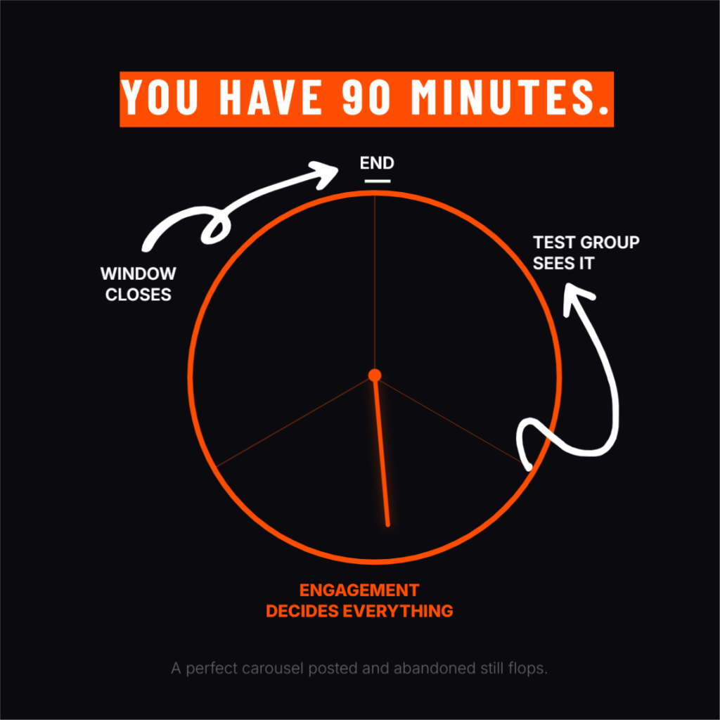
Here is the uncomfortable part. A carousel can do everything right above, perfect hook, perfect design, perfect CTA, and still underperform if the first 60 to 90 minutes after publishing go quietly. LinkedIn tests new posts with a small slice of your network first, often cited around 2 to 5 percent, and how that group responds in the opening window decides whether the post expands further or gets buried. If you publish and walk away, you are leaving the most decisive window of the entire post’s life unmanaged. Posting at a time when your actual audience is online, and replying to early comments quickly, meaningfully increases the odds that this initial test turns into broader distribution.
Run the self audit
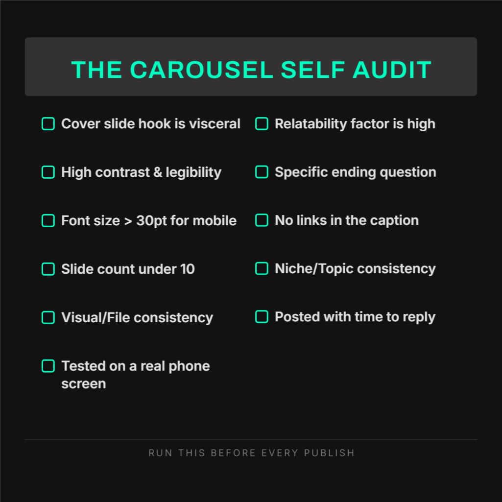
Pull up your last underperforming carousel and go through this list honestly.
- Does slide 1 make a specific claim, ask a real question, or promise something concrete, rather than stating a vague topic?
- Is there enough contrast between your text and background that you could read it comfortably with your phone brightness turned down?
- Is your body text large enough to read on a phone screen without zooming in?
- Does your carousel run 6 to 10 slides, with one idea per slide and visible white space?
- Does any slide tap into something instantly relatable, rather than reading like a corporate memo?
- Are every page’s dimensions identical, and is the resolution sharp rather than soft or pixelated?
- Have you actually opened the final exported file on a real phone before publishing?
- Does the last slide end with a specific question that invites a real answer?
- Is there a clickable link anywhere in the post body or comments?
- Does this topic match what you usually post about, or is it a one off departure?
- Did you publish at a time you could realistically reply to comments within the first hour?
If you answered “no” to two or more of these, you have likely found your actual problem, and it is probably not the one you assumed going in.
Where the right tool actually helps
Most of what breaks a carousel in Bucket A and Bucket B is execution, not strategy. Getting dimensions consistent, keeping fonts large enough for mobile, applying contrast that is actually comfortable to read, and exporting at the right resolution every single time are exactly the kinds of details that are easy to get right in theory and easy to slip on when you are moving fast.
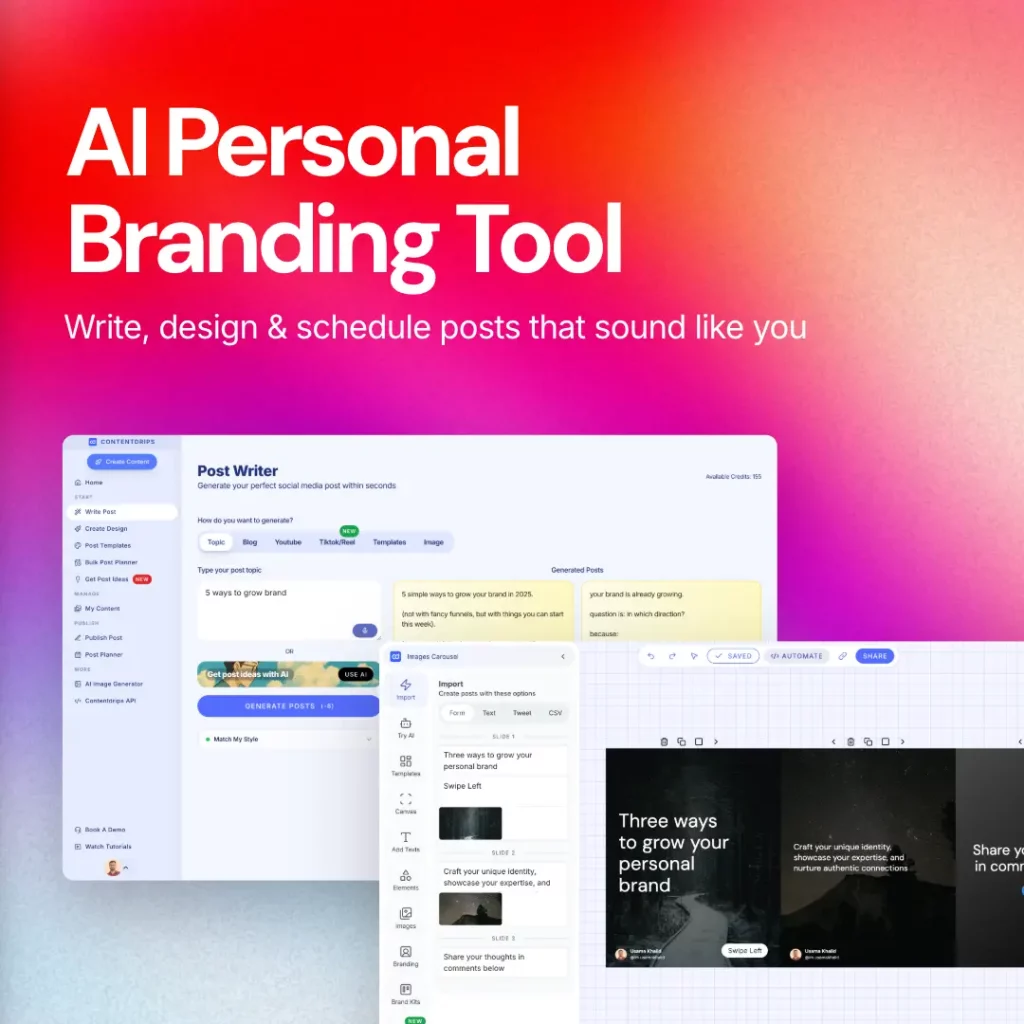
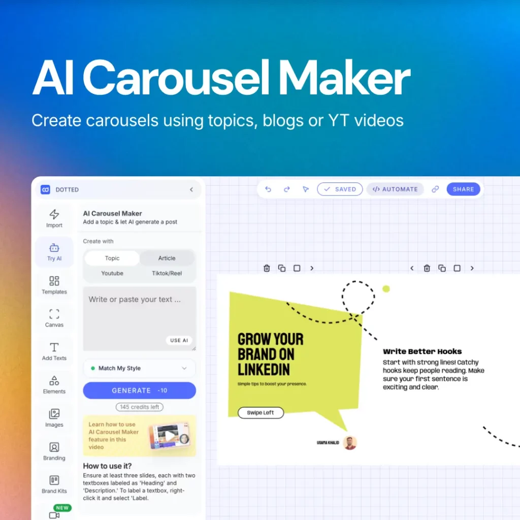
Contentdrips was built around that specific gap. Templates are pre sized correctly for LinkedIn’s document post format from the start, so mismatched dimensions and blurry exports stop being a recurring risk. Your brand kit, fonts, colors, and logo apply automatically across every slide, which keeps contrast and legibility consistent without you rechecking it manually each time. And because the AI can generate the slide copy and structure from a topic, blog post, or video in one pass, you get more time back for the part that actually drives saves and comments: the hook, the relatable angle, and the question you leave people with.
The mechanics get a carousel in front of someone. What you say once they are there is still entirely on you.